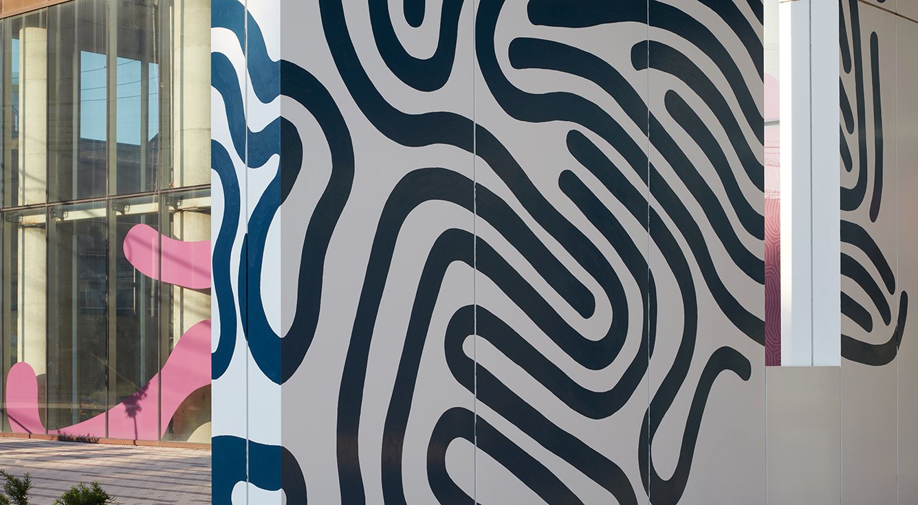
Gracing the first two stories of Nashville’s Kenect mixed-use development, M–O designed a playful, energetic mural and window treatment to expand on the existing Kenect brand identity.
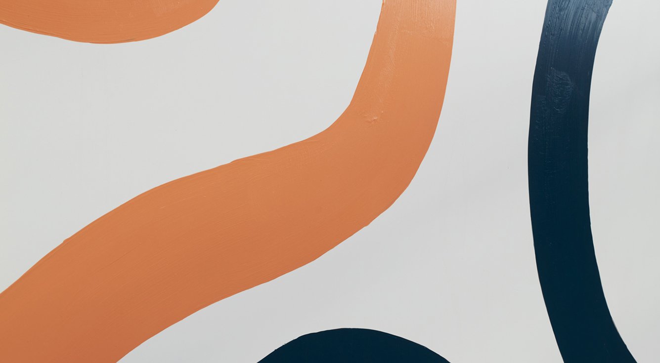
Drawing on Kenect’s existing set of colors and patterns used throughout the brand identity, designers dramatically increased the scale of the shapes to grab the attention of passers-by.
Kenect Mural
Gracing the first two stories of Nashville’s Kenect mixed-use development, M–O designed a playful, energetic mural and window treatment to expand on the existing Kenect brand identity. While retaining a strong connection to the brand’s color palette and visual patterns, a fresh iteration reinterprets them more expressively. The completed mural activates the building facade to match the energy and excitement of midtown Nashville. The design demonstrates the vibrancy of the brand’s multi-faceted community.
Drawing on Kenect’s existing set of colors and patterns (we like to think of them as squiggles) used throughout the brand identity, designers dramatically increased the scale of the shapes to grab the attention of passers-by. What were typically tone-on-tone, small background patterns grow to become the central focus on the mural’s white field. Further iteration combined different shapes and colors from each individual pattern to create a new take. Installed by muralist Wylie Caudill, the mural flows across and around the wall and through window cut-outs in contrast to the rigidity of the building’s structure.
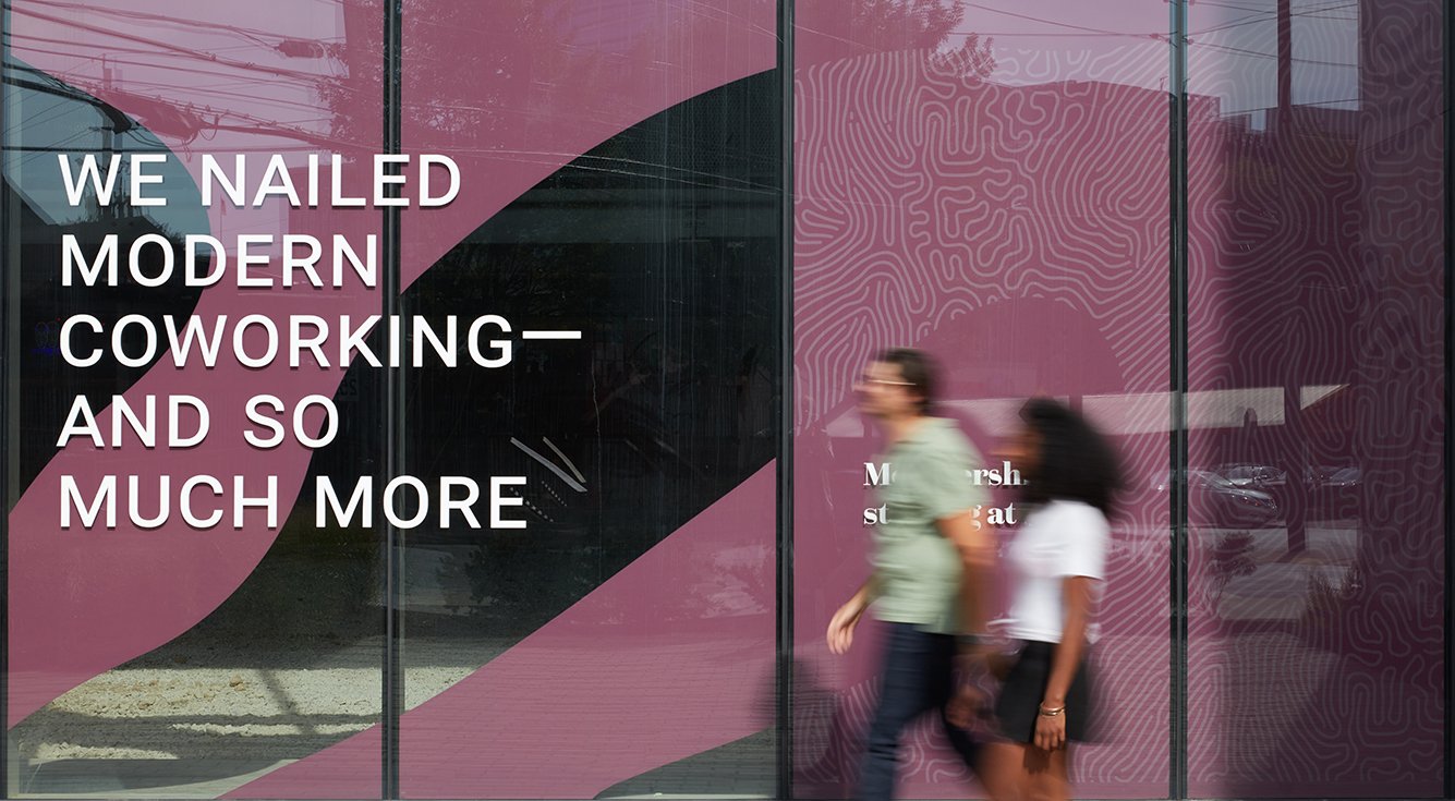
For the main level’s temporary storefront window treatments, the patterns were again scaled up and this time treated as individual elements, spreading out laterally in singular organic shapes. Responding to the client’s goal of going beyond a standard window decal, the design utilizes both the exterior and interior of the large storefront windows to create a sense of depth and dimension. High-impact white text takes the foreground on the street-side of the glass, while the large, colorful graphic forms are applied on the inside to visually frame the text and provide a background.
M-O delivered this expressive brand installation on time and on budget in spite of supply chain delays and logistic issues on site — reworking the design during fabrication to reduce costs and adjust to unknown site conditions, while ensuring that the client’s goals were met. This new, dynamic application of Kenect’s brand standards proved successful and will be incorporated into their visual identity and future properties.
Location
Nashville, Tennessee
Services
Brand Identity
Placemaking
Print
Signage
Environments
Murals
Photography
Tom Harris
Partners
Wylie Caudill
Akara Partners
Dynamark Graphics Group
Architecture by
Perkins&Will


