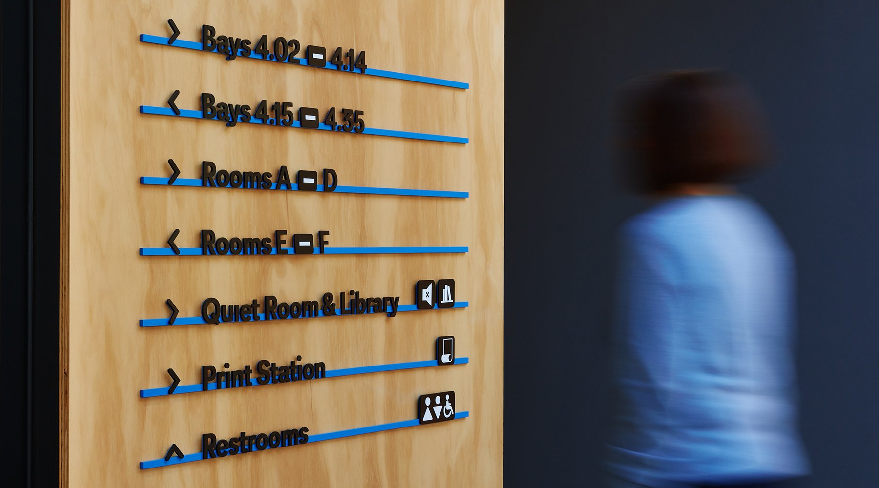
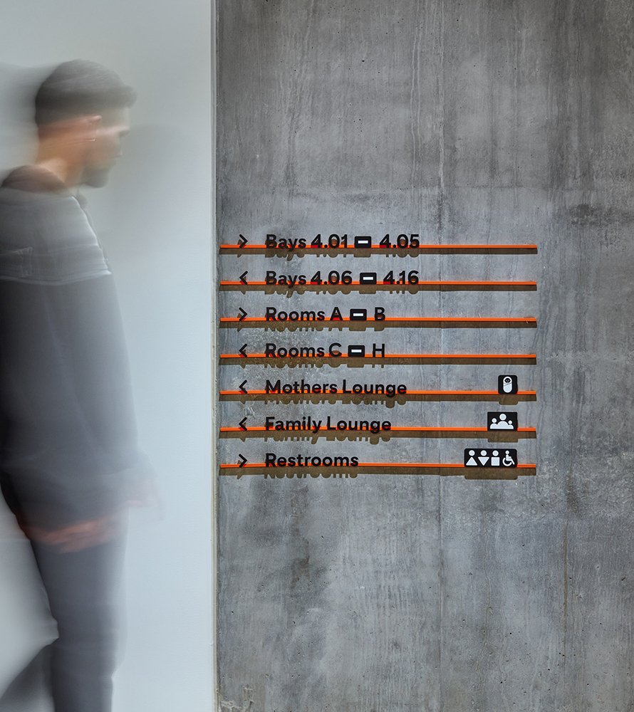
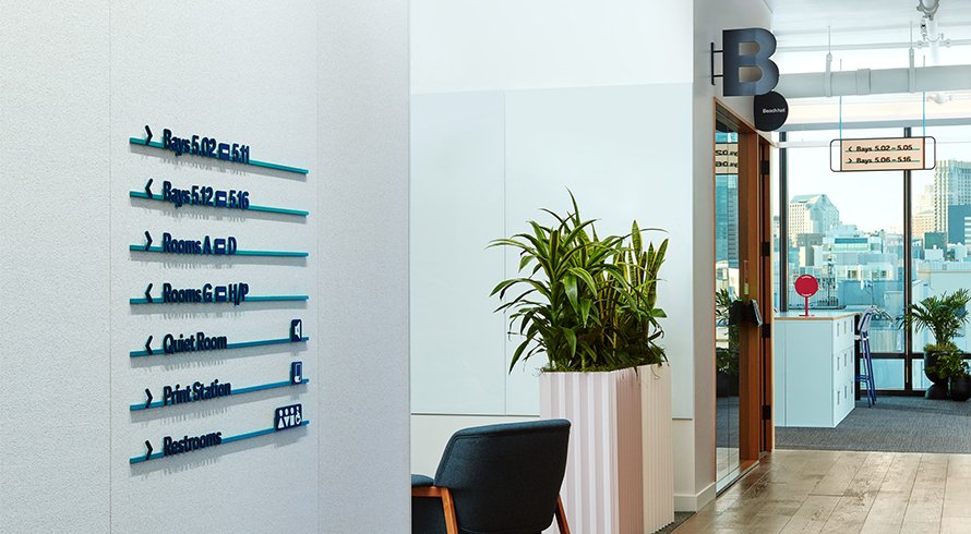
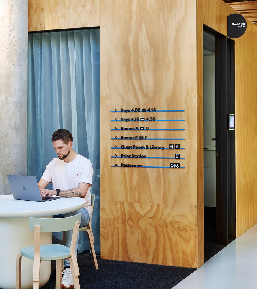
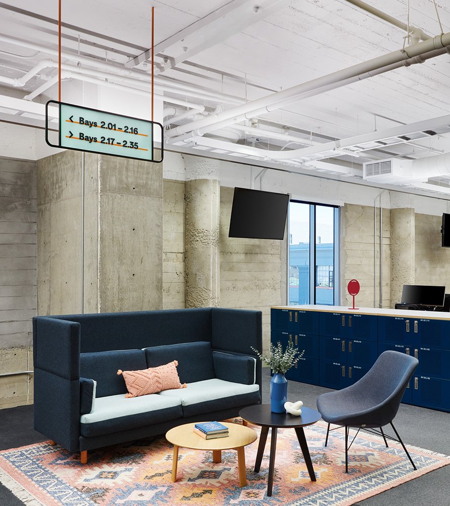
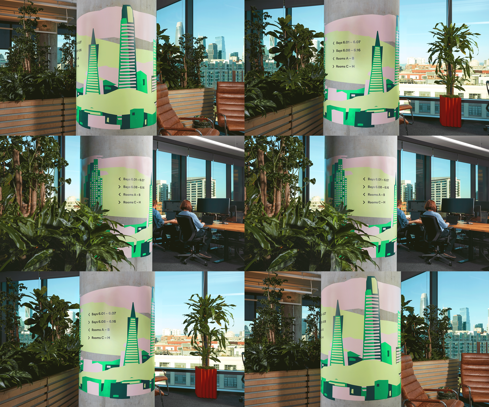
Pinterest’s Headquarters in San Francisco serves both permanent and visiting employees from across the globe. M-O designed a comprehensive signage and wayfinding system to reframe their existing office for the future of hybrid work.
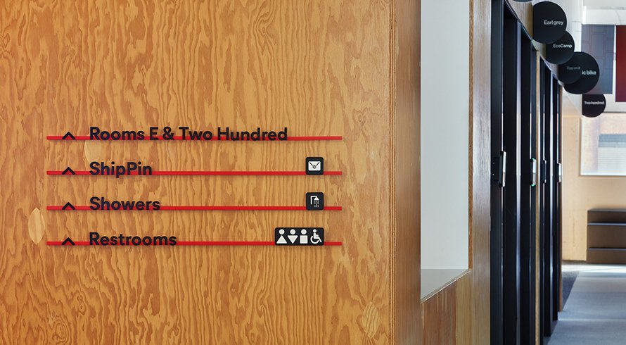
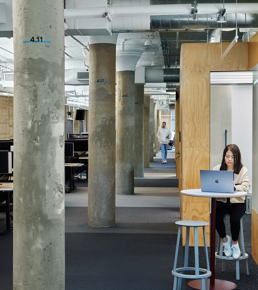
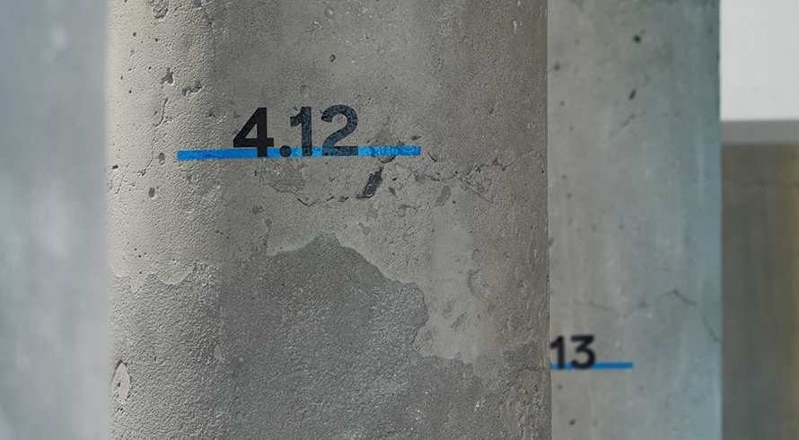
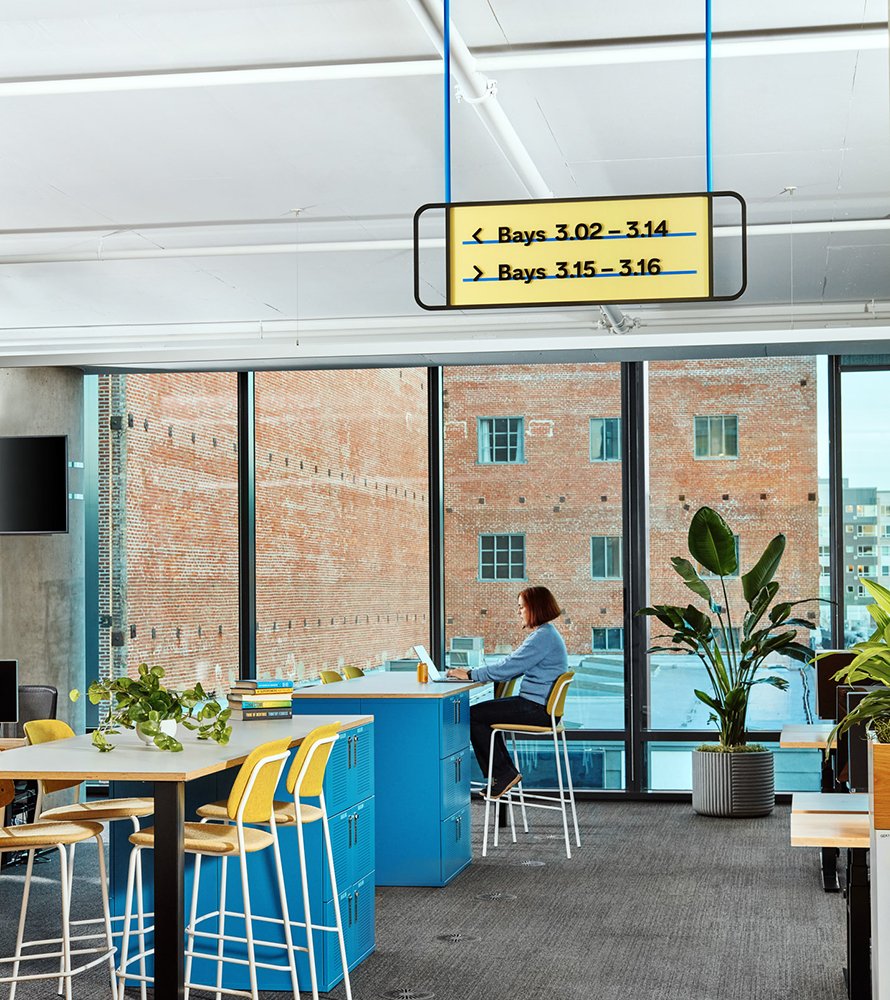
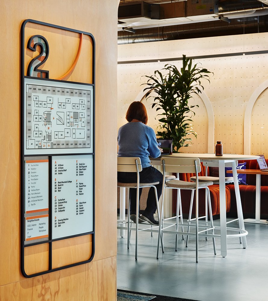
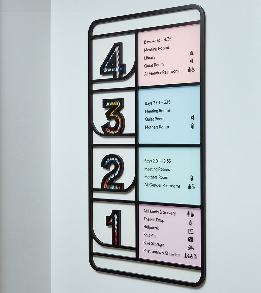
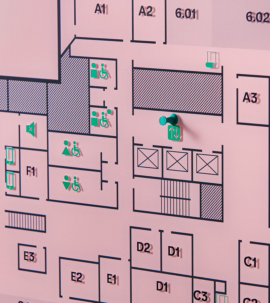
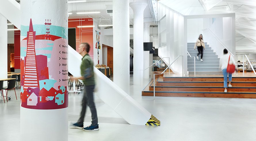
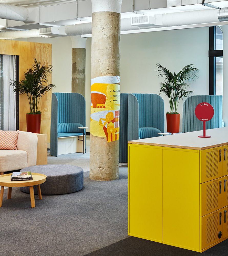
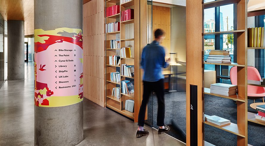
Destination directionals, building/floor directories and column applications introduce a numerical system based upon the building’s existing column grid. These numerals define perimeter workspaces known as “neighborhoods,” and shared social spaces within the building’s core.
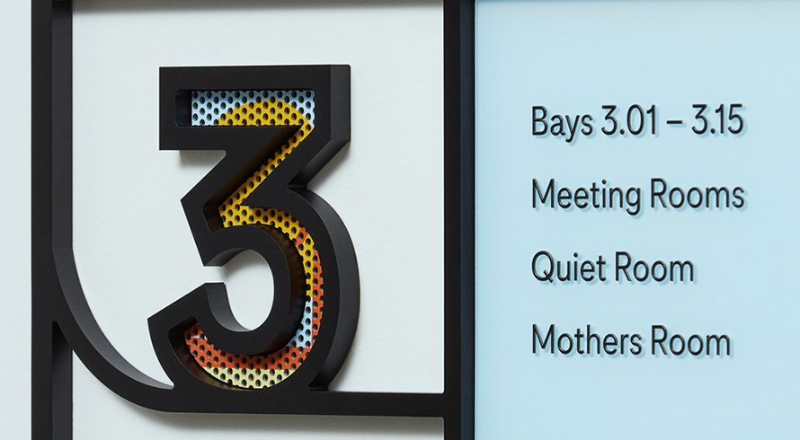
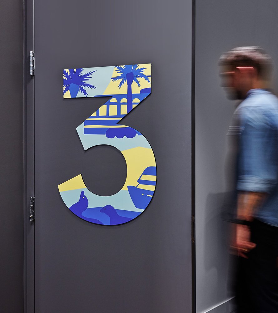
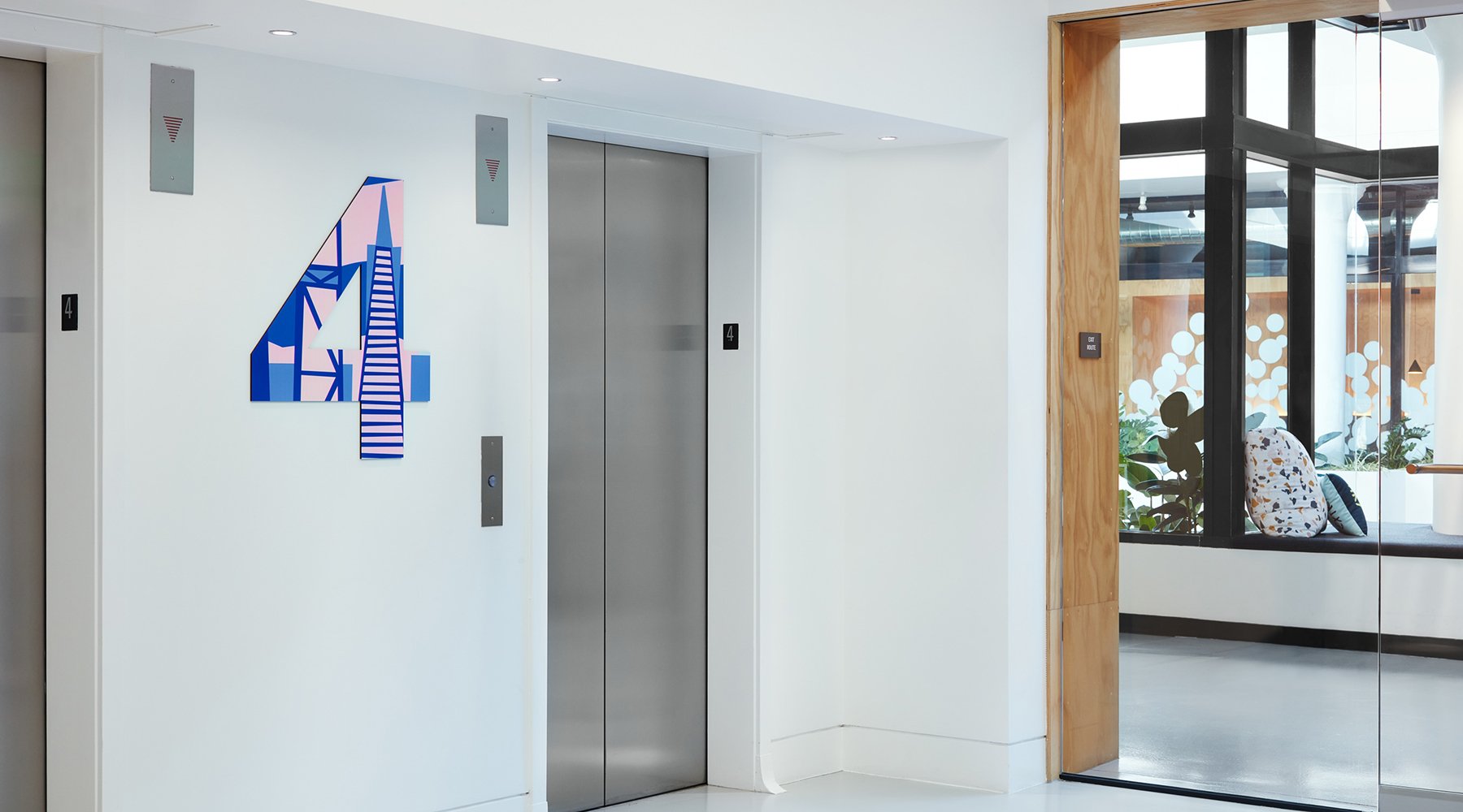
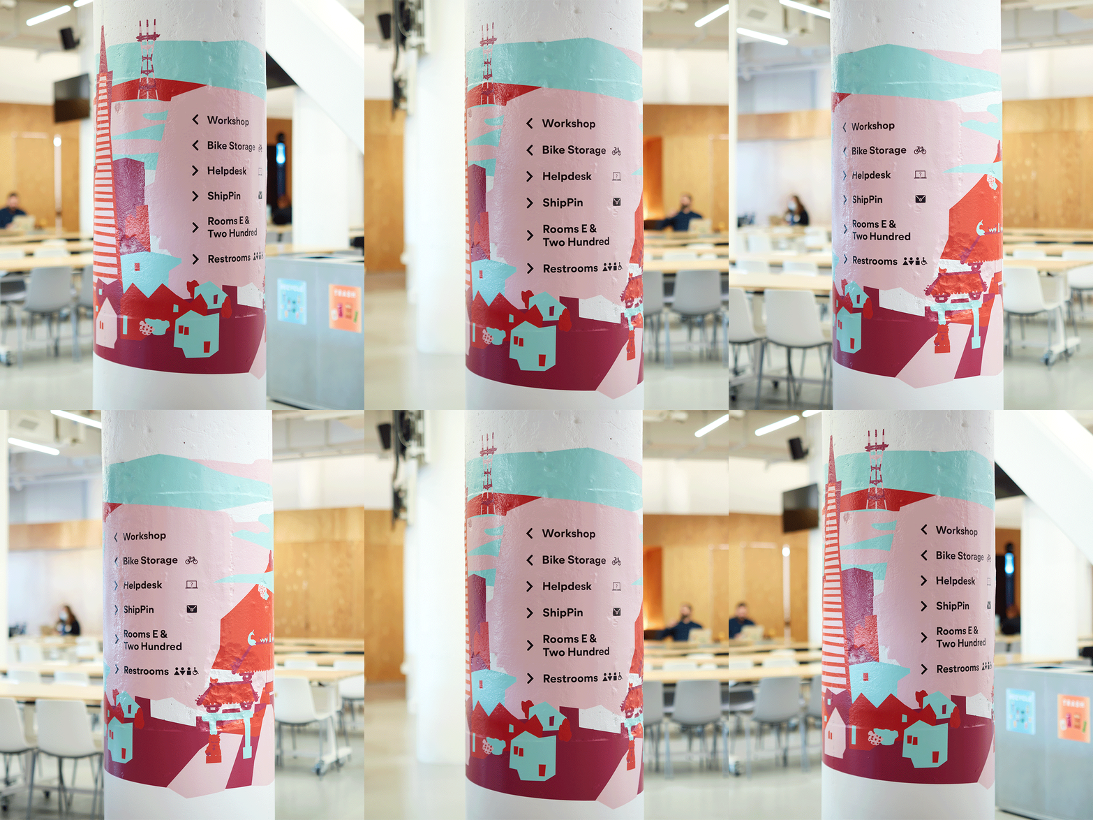
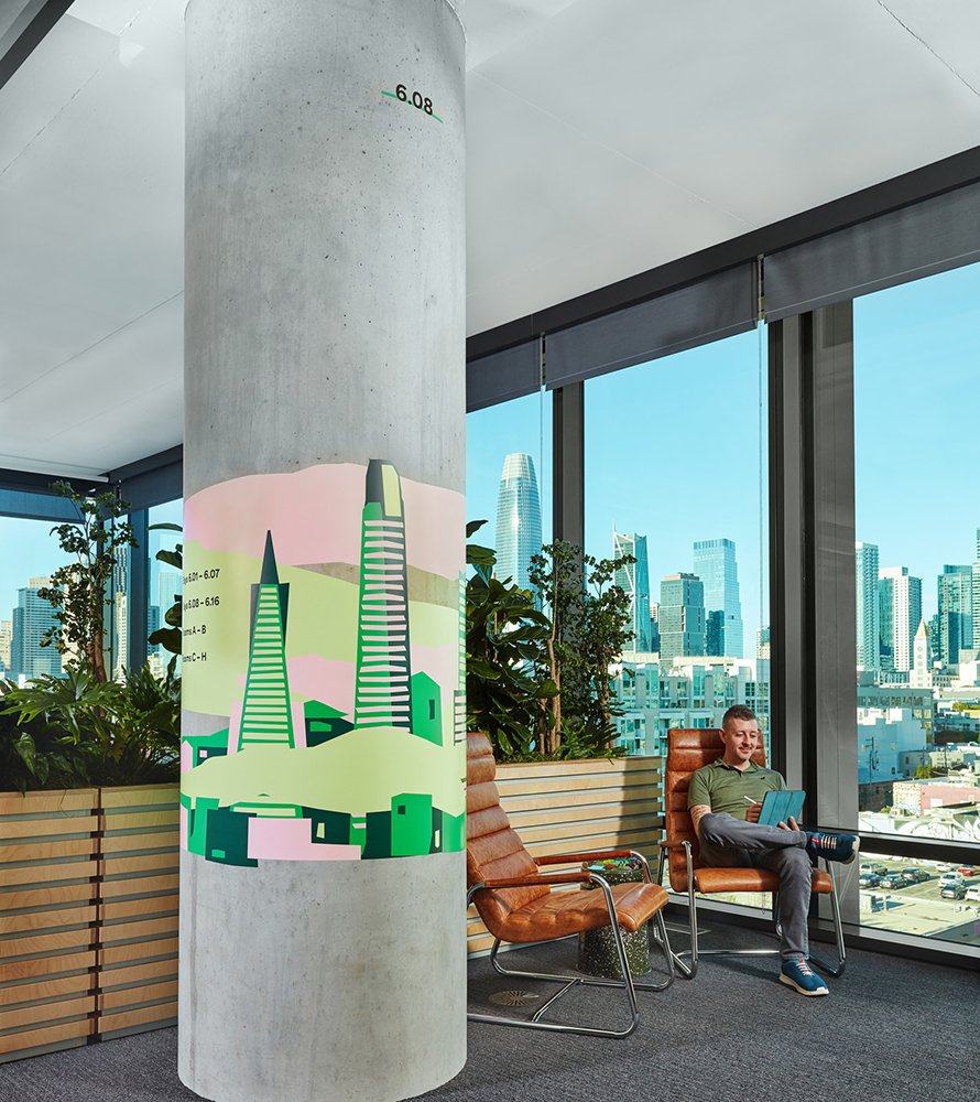
Each floor has its own unique color identity that is further expressed through graphic applications depicting local landmarks.
“ Designers staffed on our projects always have the utmost positive attitude and passions. I enjoy working with the Media-Objectives team very much.”
Illustrated scenes, at each lobby and on perimeter columns, evolve from streetscape views on the ground floor, to skyscraper views on the 6th floor. Their bold, colorful appearance brings the fun-loving Pinterest identity into the offices’ neutral architectural palette.
Pinterest San Francisco
As an international company, Pinterest’s Headquarters in San Francisco serves both permanent and visiting employees from across the globe. M-O designed a comprehensive signage and wayfinding system to reframe their existing office for the future of hybrid work. Pinterest brand geometries, San Francisco landmarks, and the building’s architectural elements were expressed in this clean and playful navigation system.
Destination directionals, column applications, and the building directories introduce a numerical system based upon the building’s existing column grid. These numerals define predetermined, perimeter workspaces known as “neighborhoods,” and shared social spaces within the building’s core. By basing the pathfinding strategies around permanent architectural elements, the wayfinding system can adapt to office layout rearrangements without needing to update the signage itself.
The design team studied employee circulation patterns to determine optimal signage locations that reinforces spatial understanding of the radial arrangement of meeting rooms. This matrix of hierarchical signage efficiently directs familiar employees and eases office navigation for new employees.
Black, rounded-corner frames wrap signage, complementing architectural finishes in color and Pinterest brand geometries in form. The signs then incorporate Pinterest brand colors whose pastel tones allow text to stand out against the bold frames. Each floor has its own unique color identity that is further expressed through graphic applications depicting local landmarks.
Iconic San Francisco sights such as the Golden Gate Bridge, the Transamerica Pyramid, Giant’s Stadium, and the Painted Ladies are illustrated to coincide with workstation “neighborhoods” and offer a sense of pride in location. The illustrated scenes serve as 360 degree murals on the columns, and evolve from streetscape views on the ground floor, to skyscraper views on the 6th floor. Their bold, colorful appearance brings the fun-loving Pinterest identity into the offices’ neutral architectural palette.
This inspiring signage and wayfinding system proved successful in easing employee return-to-work and navigation throughout the office. Its adaptable nature, readability, and hybrid work focus has led Pinterest to deploy the system to its offices globally.
Location
San Francisco, California
Services
Placemaking
Wayfinding
Strategy
Signage
Environments
Awards
Honorable Mention, Interior Design Magazine
Merit, SF Design Week
Photography
Ian Vecchiotti
Partners
Priority Architectural Graphics

