

A new website, brand guidelines, and a modernized logo bring a fresh new look to this 120-year-old family real estate development company.
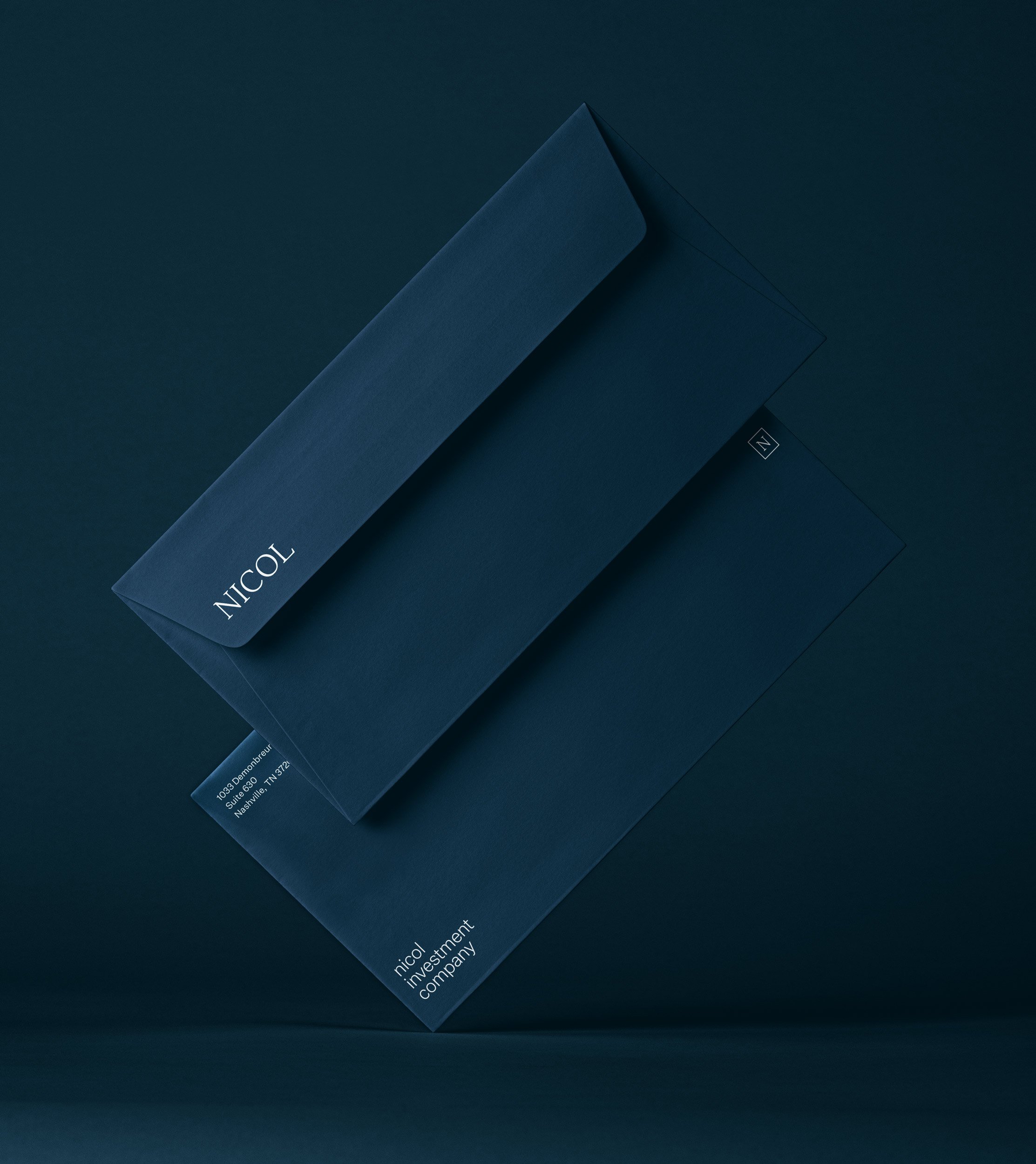
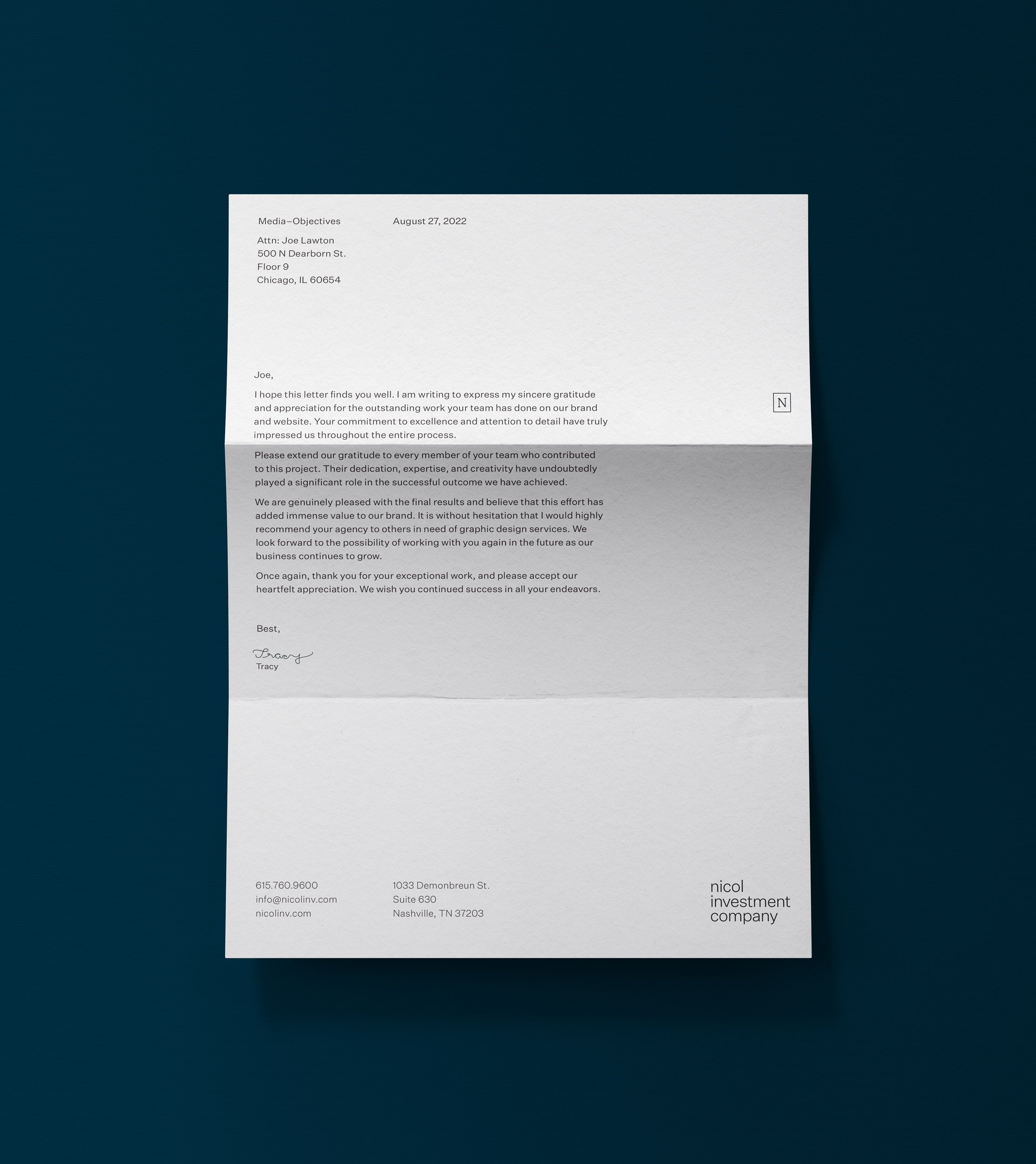
A flexible brand system allows for both formal and informal moments.

Limited to a palette of four, color is drawn from classic office materials.

Characters from Yanghee Ryu’s Gowun Batang were customized to form the Nicol wordmark.
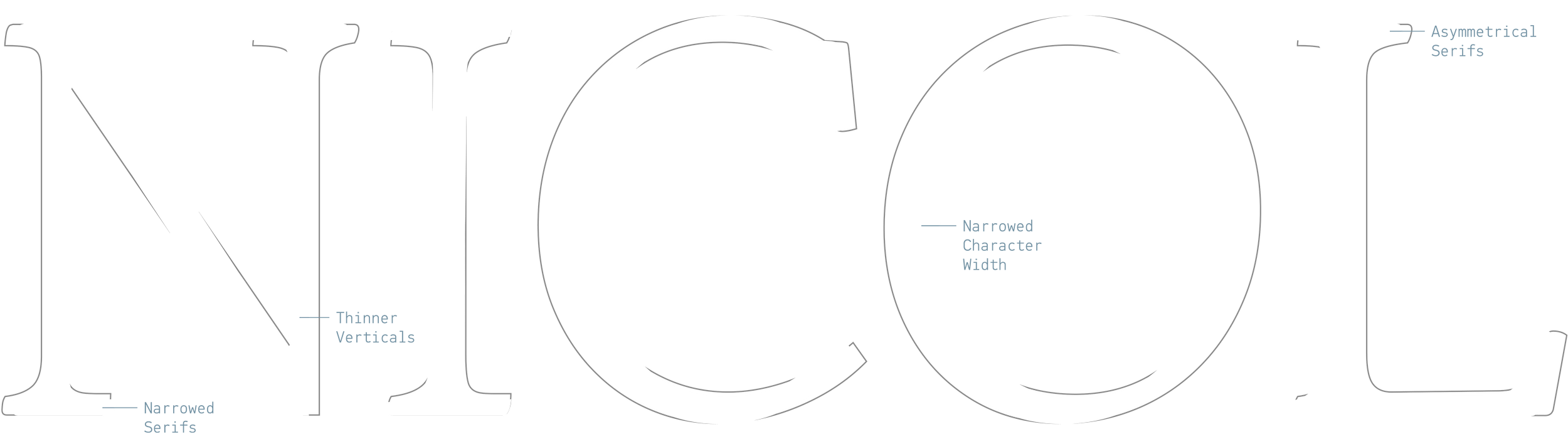
The foremost challenge in designing the Nicol brand was to find the balance between classic and modern aesthetic influences, while carefully avoiding a drift too far from their existing identity.
Nicol Investment Company
Running deep familial roots, Nicol Investment Company started as a cattle ranching and land management business nearly 120 years ago. True to their ideologies of honesty, humility, and hard work, Nicol was looking to re-imagine their brand and update their website and digital experience, while staying true to their core values.
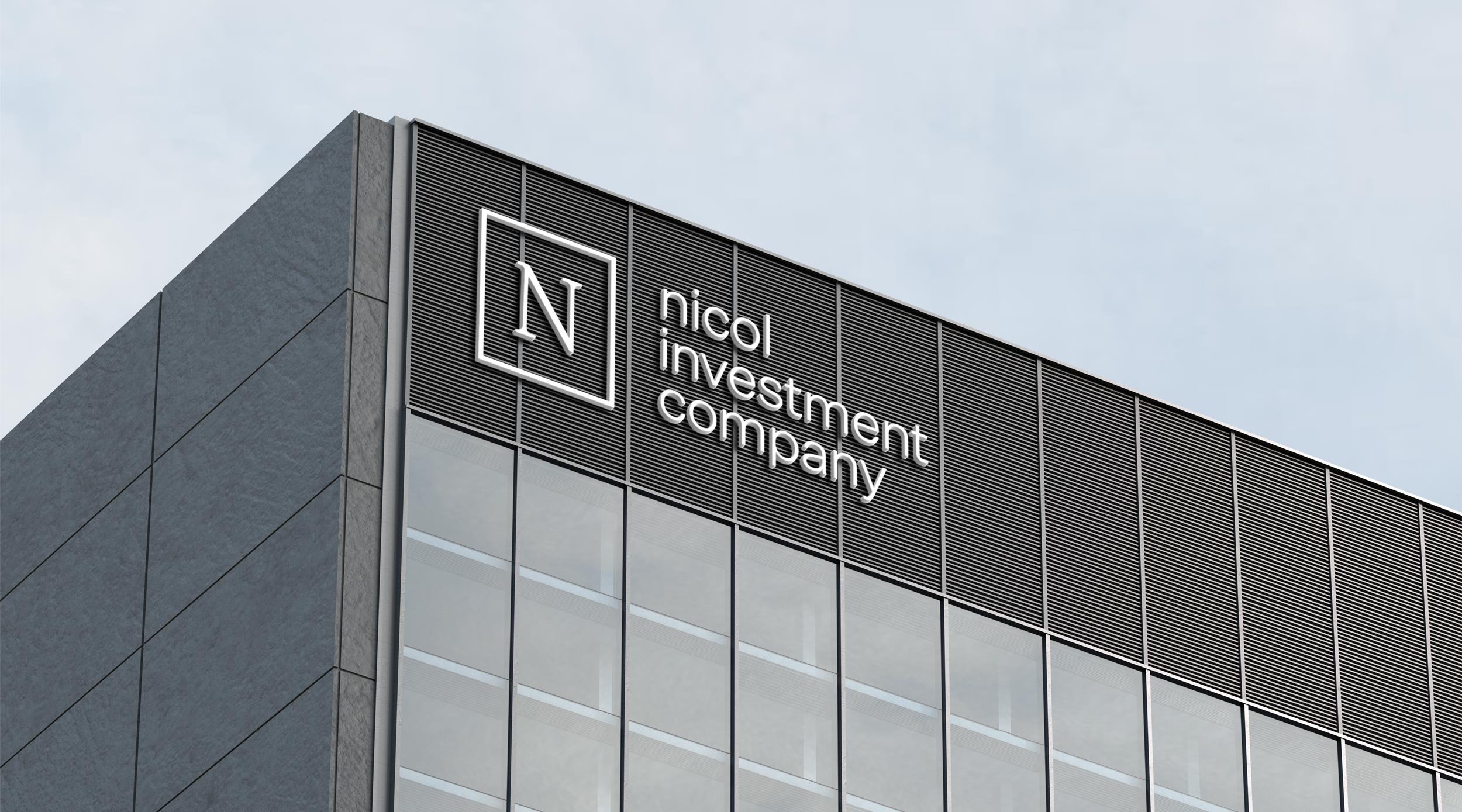
By building on past iterations of the brand, the look is refreshed but true to its beginnings, giving way for new opportunities the company seeks and the partnerships they will form. A flexible system for a broad application and appearance, our design team developed a new brand hierarchy that incorporates parts and pieces, as well as a typographic system that creates the new Nicol Investment company identity.
Location
Nashville, Tennessee
Services
Brand Identity
Digital
Logo
Print
Website
Brand Guidelines