Working with the team at Valerio Dewalt Train, we were asked to design side by side showrooms and create an experience that embodies two separate brands in Chicago’s historic Merchandise Mart.
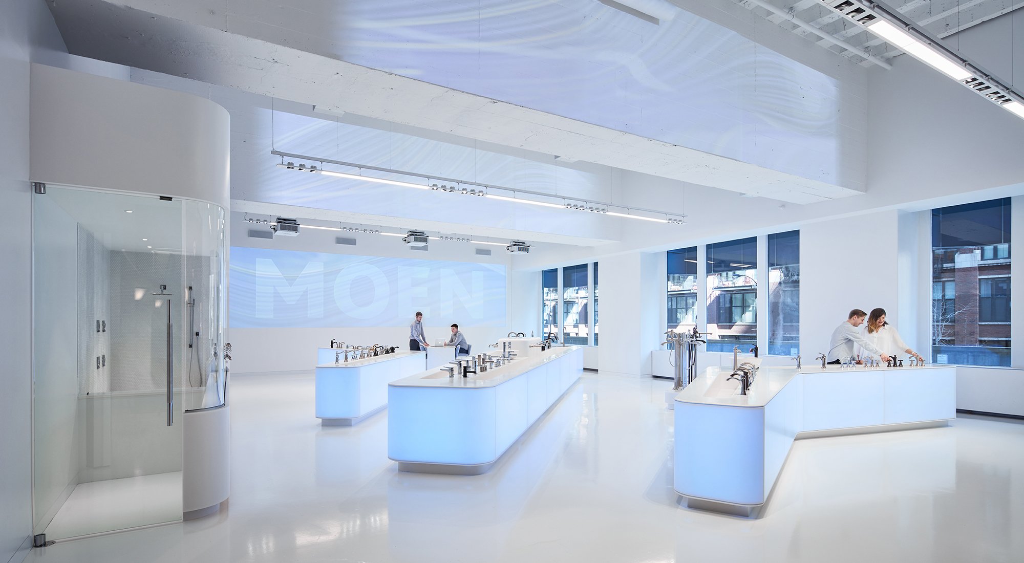
To convey the beauty of water, we collaborated with the digital experience agency NEXT/NOW to project abstract motion graphics, taking advantage of the ceiling’s tall concrete trusses. The presence of people generates water-like ripples that undulate across the main wall, creating a subtly interactive experience.
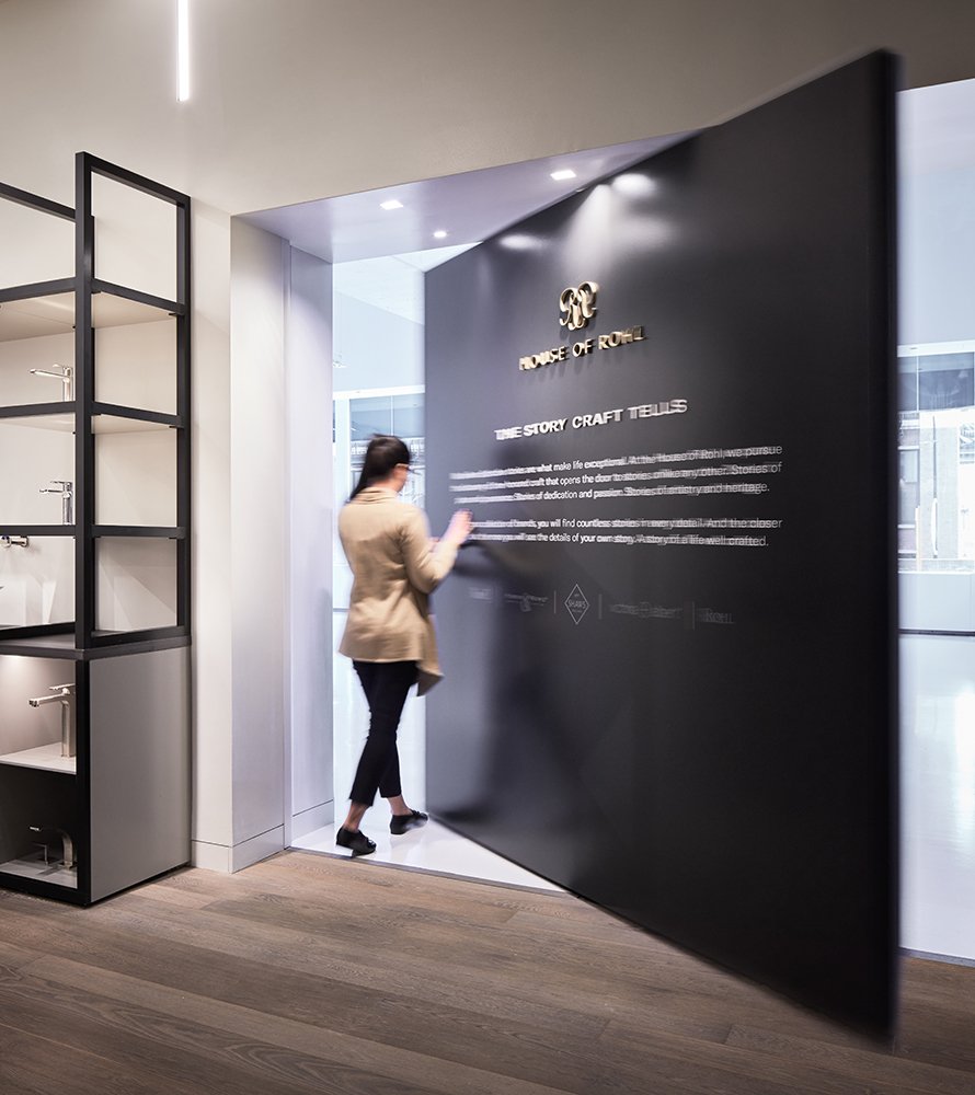
As different as they look, the two showrooms connect to one another. A pivot door on their shared wall allows users to explore both brands.
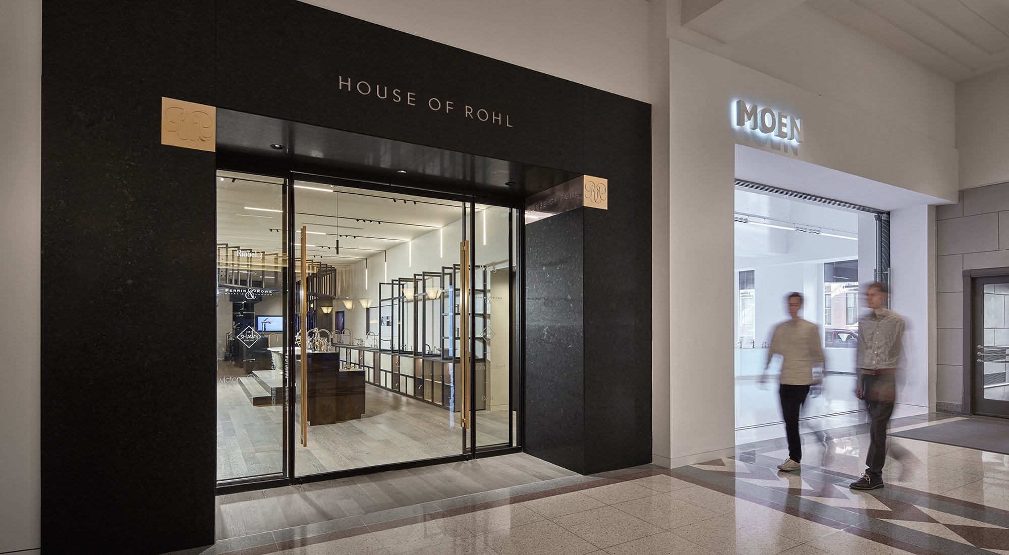
The House of Rohl entrance is a dark granite portal with inlaid bronze plaques engraved with the brand logo. This creates a more intimate entry that expresses high quality craft.
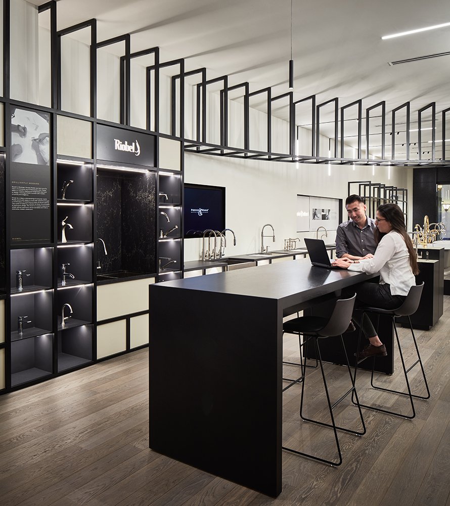
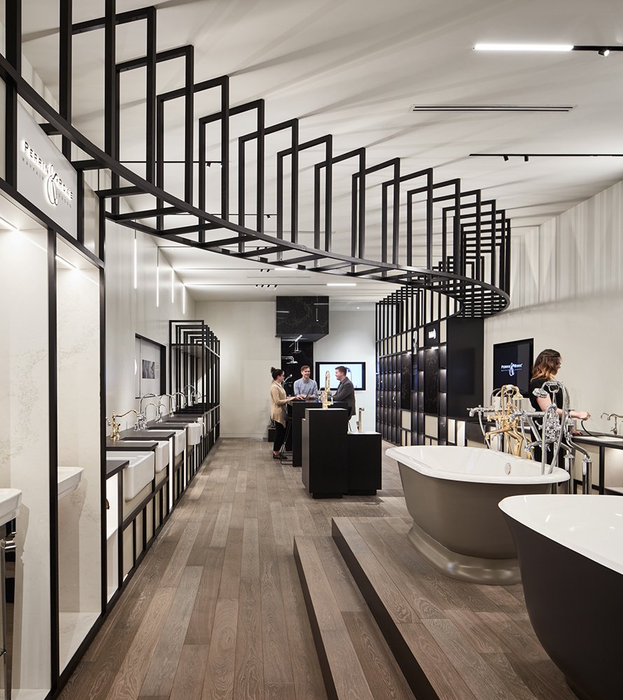
Catching the eyes of passersby and drawing them into the House of Rohl space, a curvilinear chassis of powder-coated aluminum supports a grid of boxes housing the plumbing fixtures on display.
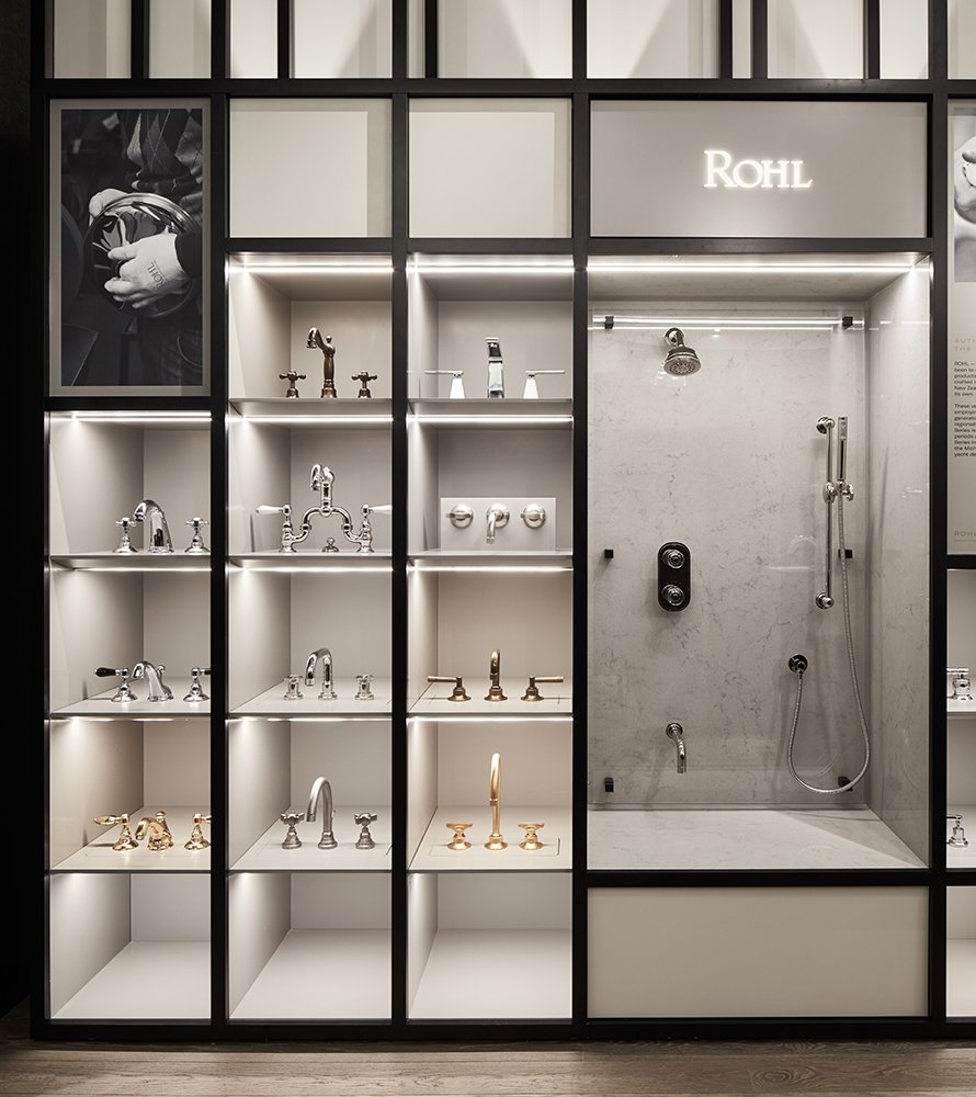
Within the chassis, we gave each sub-brand in the House of Rohl collection its own area. Panels tell each sub-brand’s story, focusing on the craft that goes into making the products. It’s a more museum-like approach than with the Moen showroom.
“This project is a perfect example of an intense collaboration between architecture, interior design, and experiential design studios. Through this collaborative process, we were able to create a truly unique and holistic brand experience.”
MOEN + House of Rohl
MOEN and House of Rohl are both plumbing fixture manufacturers owned by Fortune Brands Global Plumbing Group. Working with interior designers at Valerio Dewalt Train, we were asked to design their side by side showrooms and create an experience that embodies each brand in Chicago’s historic Merchandise Mart (aka theMART). However, the two spaces look completely different—by design. Because each brand has its own distinct character, the showrooms may be housed on the same block, but their relation is purely neighborly.
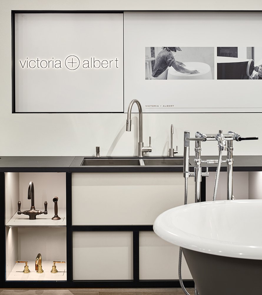
Moen, the #1 faucet brand in North America, provides a wide array of thoughtfully designed kitchen and bath faucets, shower heads, sinks etc. for residential and hospitality use with a focus on innovation, style, and durability. The House of Rohl focuses on highly handcrafted products and brings together a number of Canadian and European sub-brands, including: Riobel, Perrin & Rowe, Saws, ROHL, and Victoria + Albert.
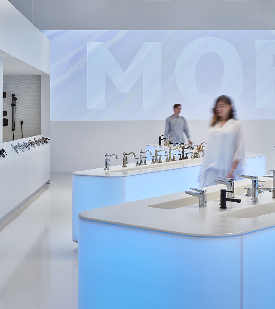
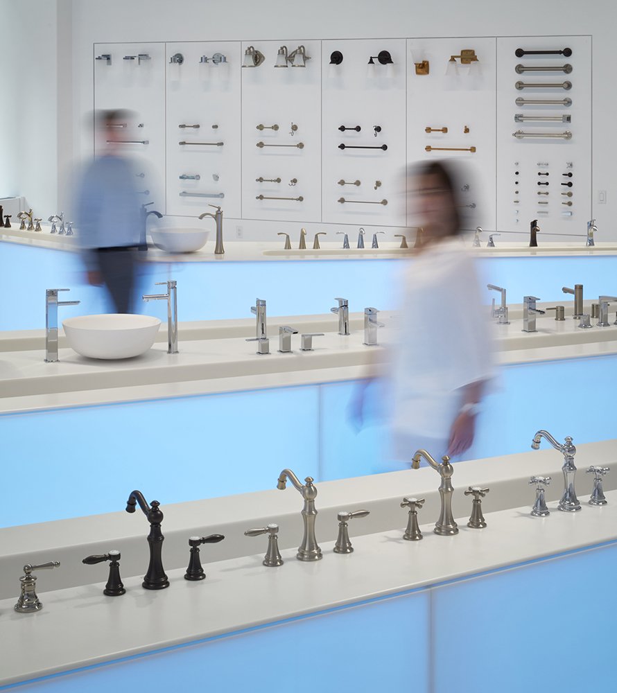
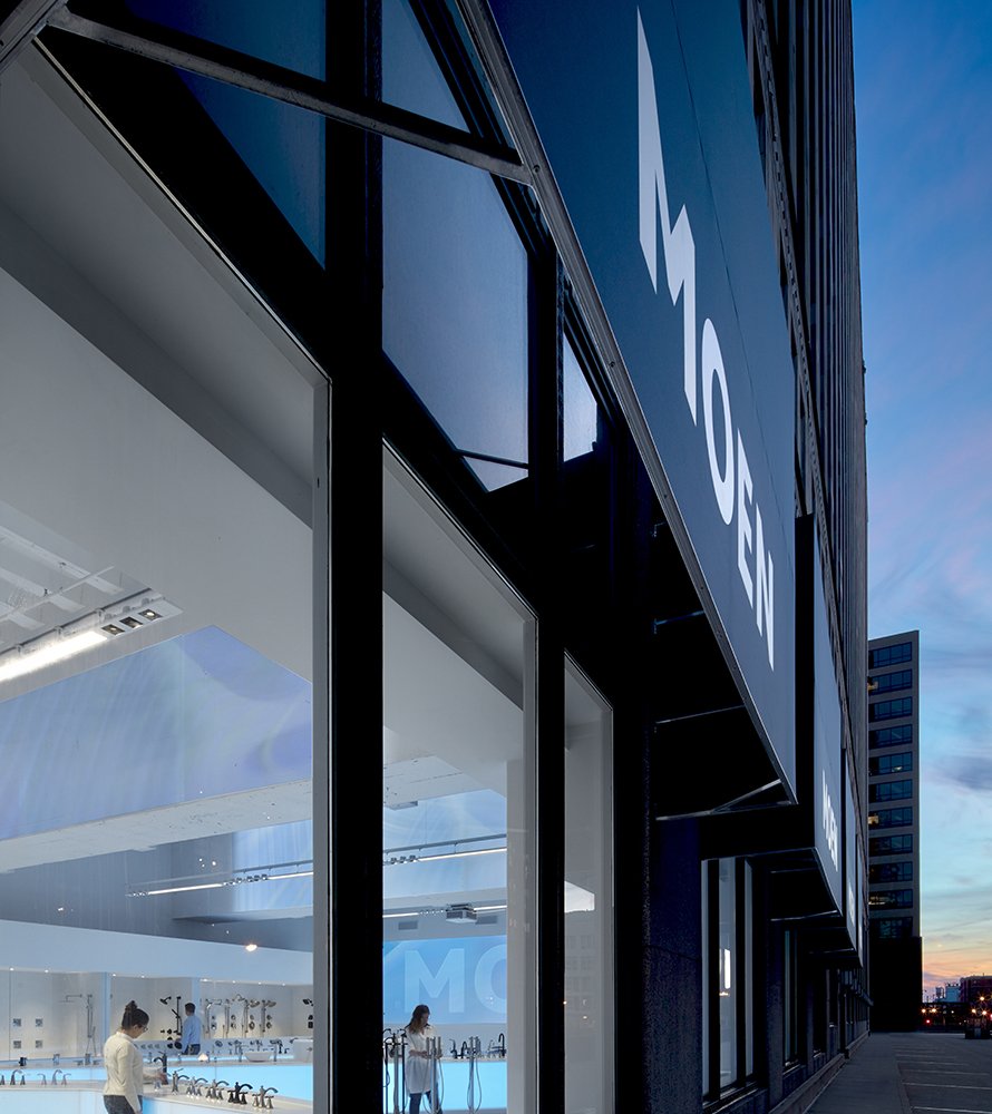
One of the main focal points of the Moen showroom invites customers to experience the beauty of water, in order to connect with the products. Most of the fixtures on display actually dispense water into troughs, allowing customers to get their hands wet. Similarly, showers are displayed in open booths and are also operable.
Because Moen offers a number of technologically advanced fixtures, technology was used to further illustrate the beauty of water. We collaborated with the digital experience agency NEXT/NOW to project abstract motion graphics. The back wall draws people through the space by extending the projected graphics onto this surface. In the ceiling, sensors detect the number of people occupying a given zone. The presence of people generates water-like ripples that undulate across the space, creating a dynamic, subtly interactive environment. The more people in a zone, the larger the ripple. The soft motion and blue glow of the ripples form a calm and glowing atmosphere.
A white box display extends from the ceiling, walls, and millwork to allow the fixtures to be the main focus of attention. To ground the overall experience, millwork features backlit curved panels of translucent Corian, visually tying these surfaces to the projections.
The entry to the Moen space, a minimalist design with illuminated tone-on-tone branded signage, has two enormous sliding glass doors, adorned with a custom graphic film that mimics the movement of the projection imagery. In contrast, the House of Rohl entrance is a dark granite portal, with inlaid bronze plaques on either side engraved with the House of Rohl logo. The intent was to create a more intimate entry with materials that express high quality craft.
Catching the eyes of passersby and drawing them into the House of Rohl space, a curvilinear chassis of powder-coated aluminum supports a grid of boxes housing the plumbing fixtures on display. The chassis also serves as a framework for lighting fixtures—strips, pendants, and spotlights are all magnetized and can be redistributed wherever and whenever needed.
Within the chassis, each sub-brand in the House of Rohl collects its own area. Panels tell each sub-brand’s story, focusing on the craft that goes into making the products in an exhibit-like experience.
As different as they look, the two showrooms connect in two places. A pivot door on their shared wall allows users to explore both brands. On the House of Rohl side, the door’s aesthetic is very clean, with bronze, brass, gold, a color logo emblem for the House of Rohl and its sub-brands, and a brand statement. The Moen side is all white, with brand-specific phrases in raised white lettering. With the door, when Fortune’s Global Plumbing Group comes together for meetings here, the two spaces can be opened up to each other.
Side by side, the Moen and House of Rohl showrooms are good neighbors—different brands, different looks, different customers, but still part of the same block.
Location
Chicago, Illinois
Services
Digital
Placemaking
Strategy
Signage
Environments
Interactive
Installation
Photography
Tom Harris
Partners
CBRE
Hugh Lighting Design
IMEG Corp
NEXT/NOW
Architecture by
Valerio Dewalt Train


