

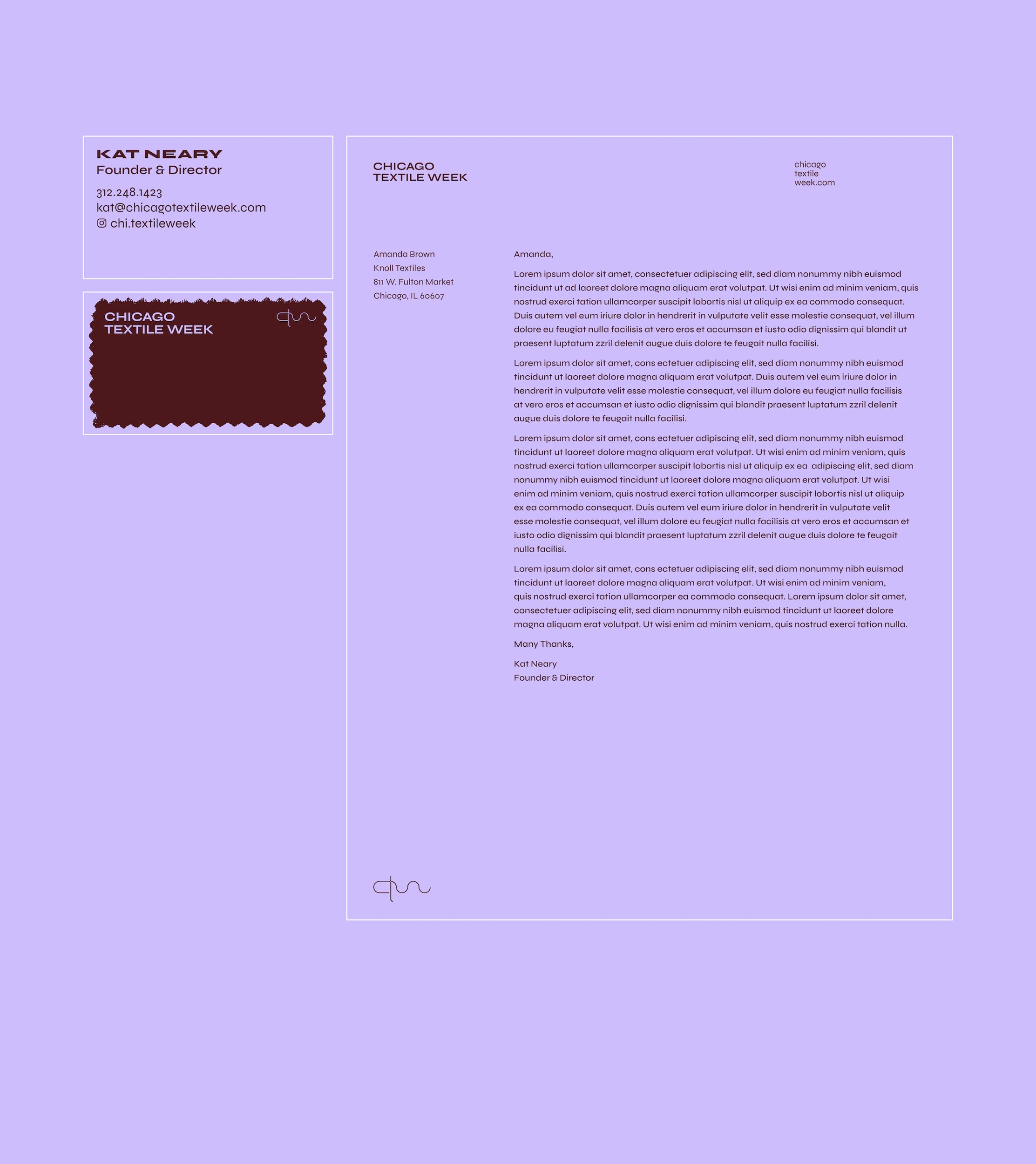
Chicago Textile Week weaves together the interior design, fiber art, and fashion industries into an exploration of Chicago's past and future of textiles. Our multidisciplinary design team established a graphic language that spoke to the nature of textiles, conveying information in a bold, yet minimal way.

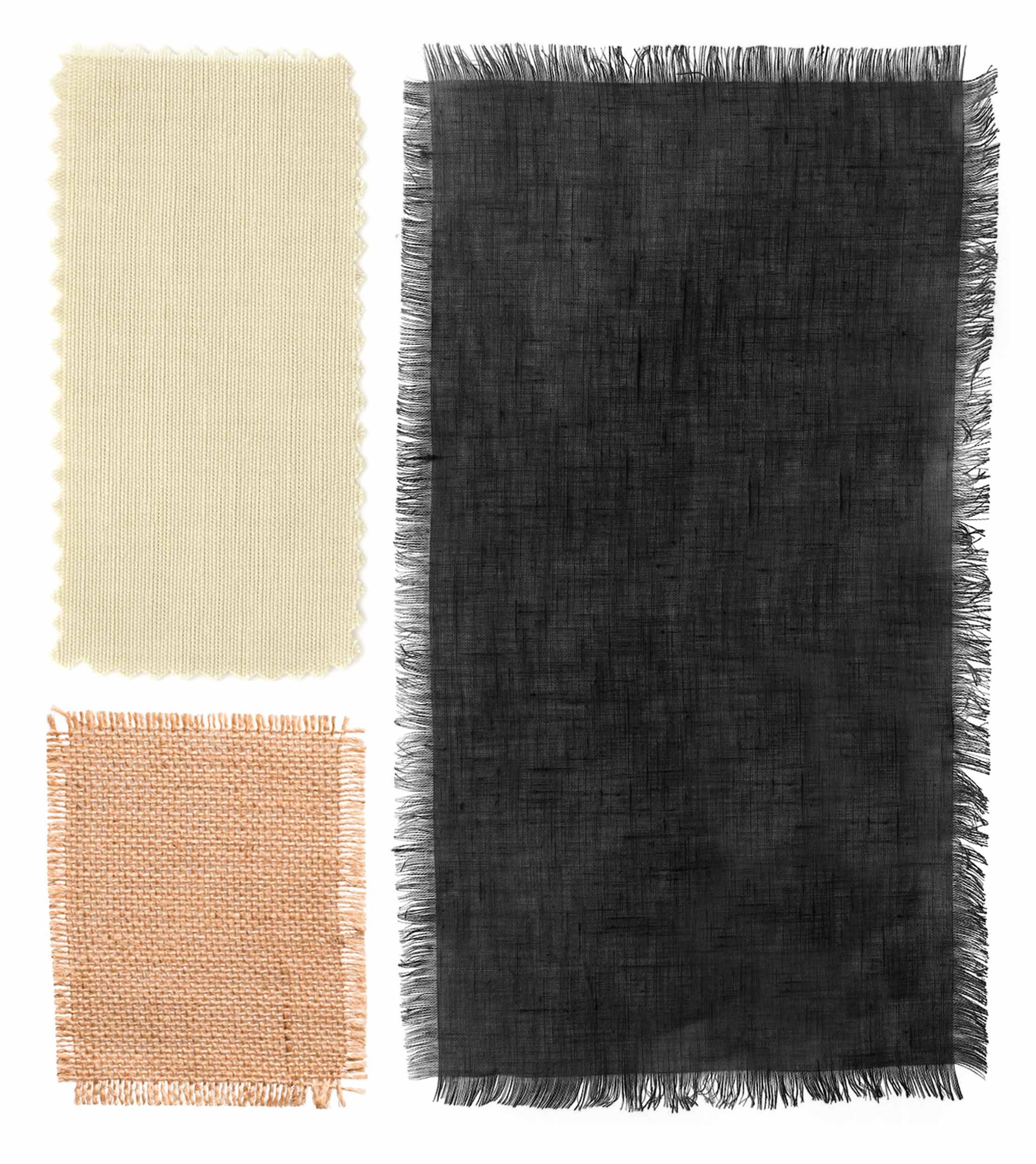
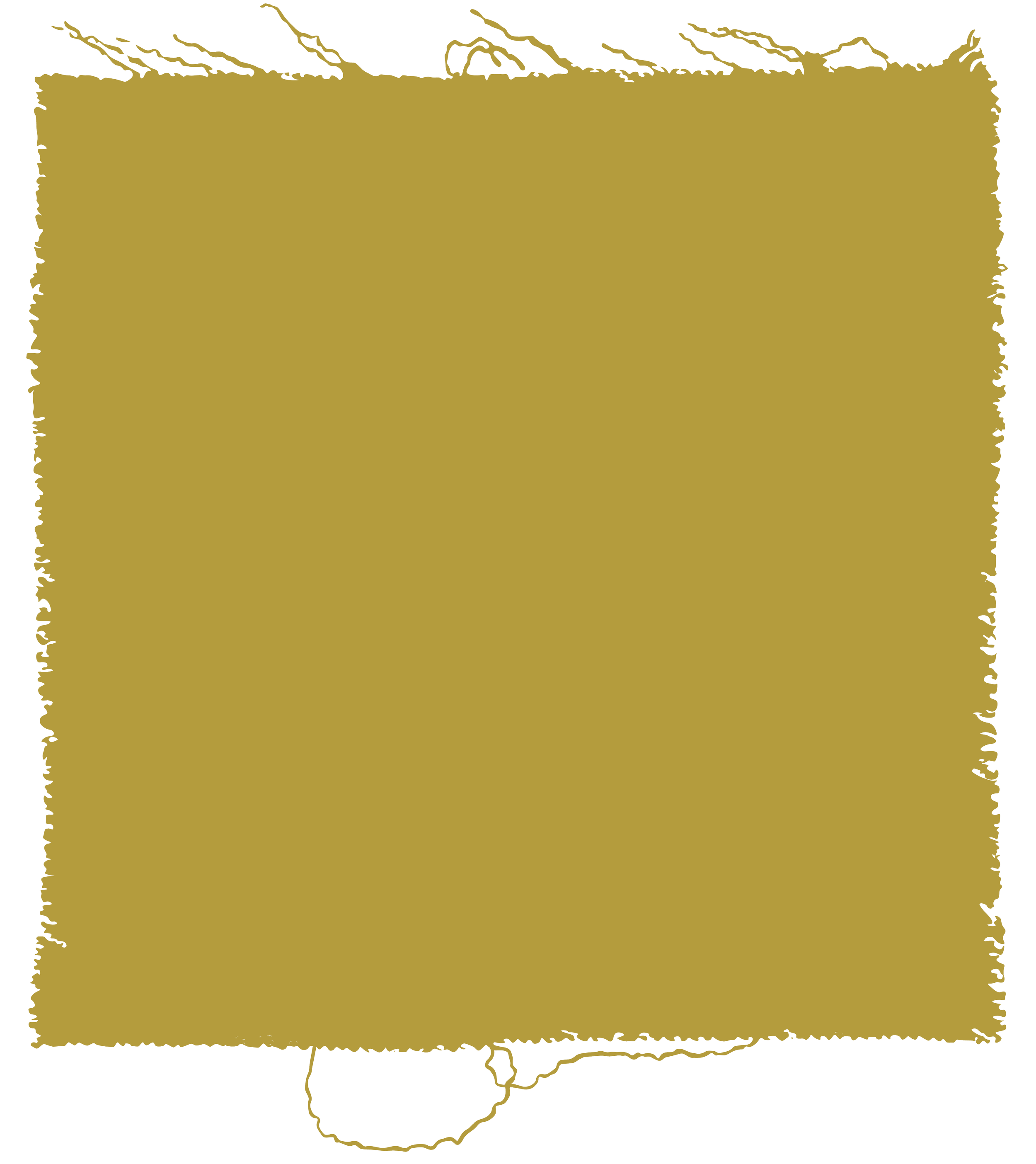
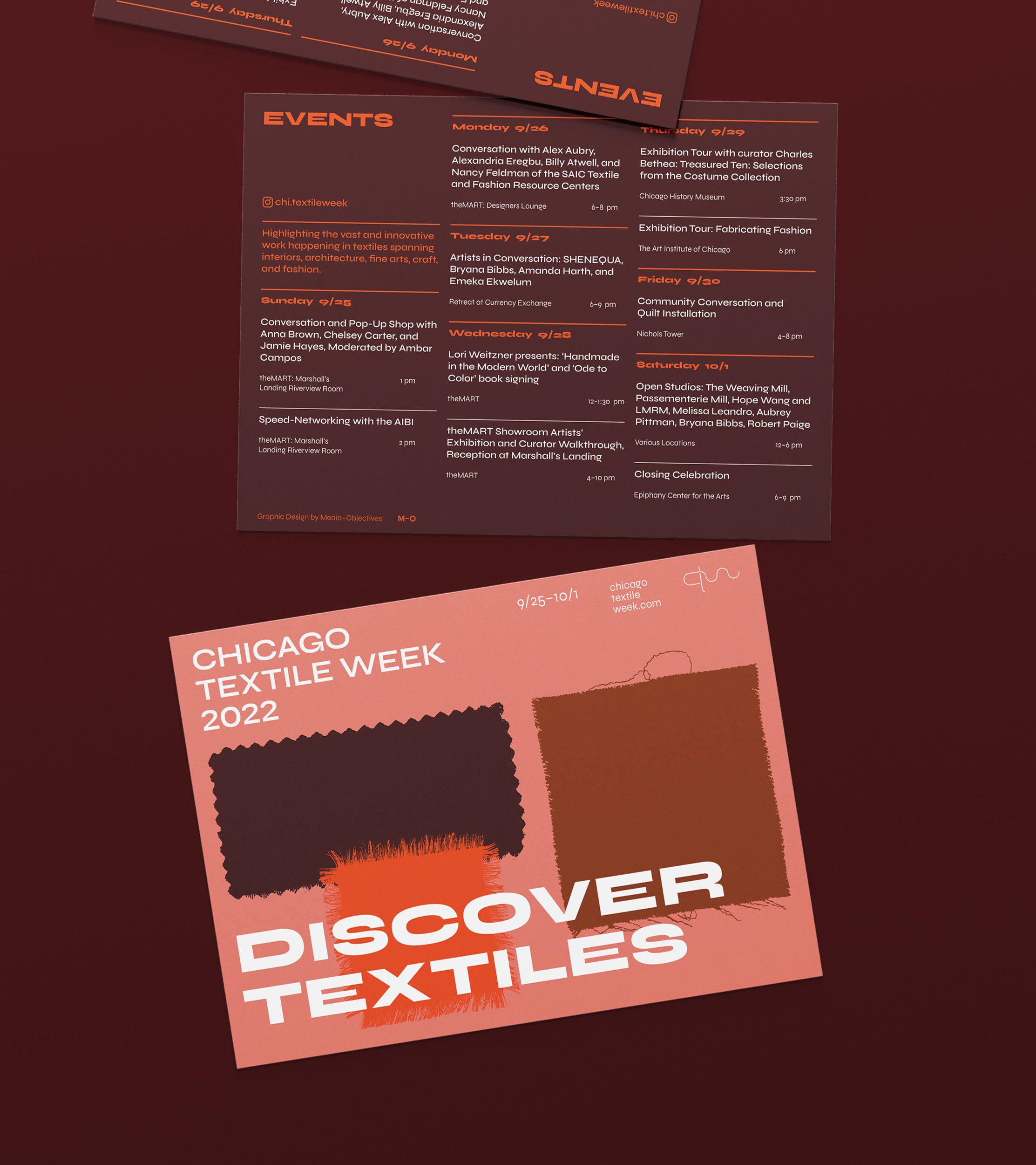
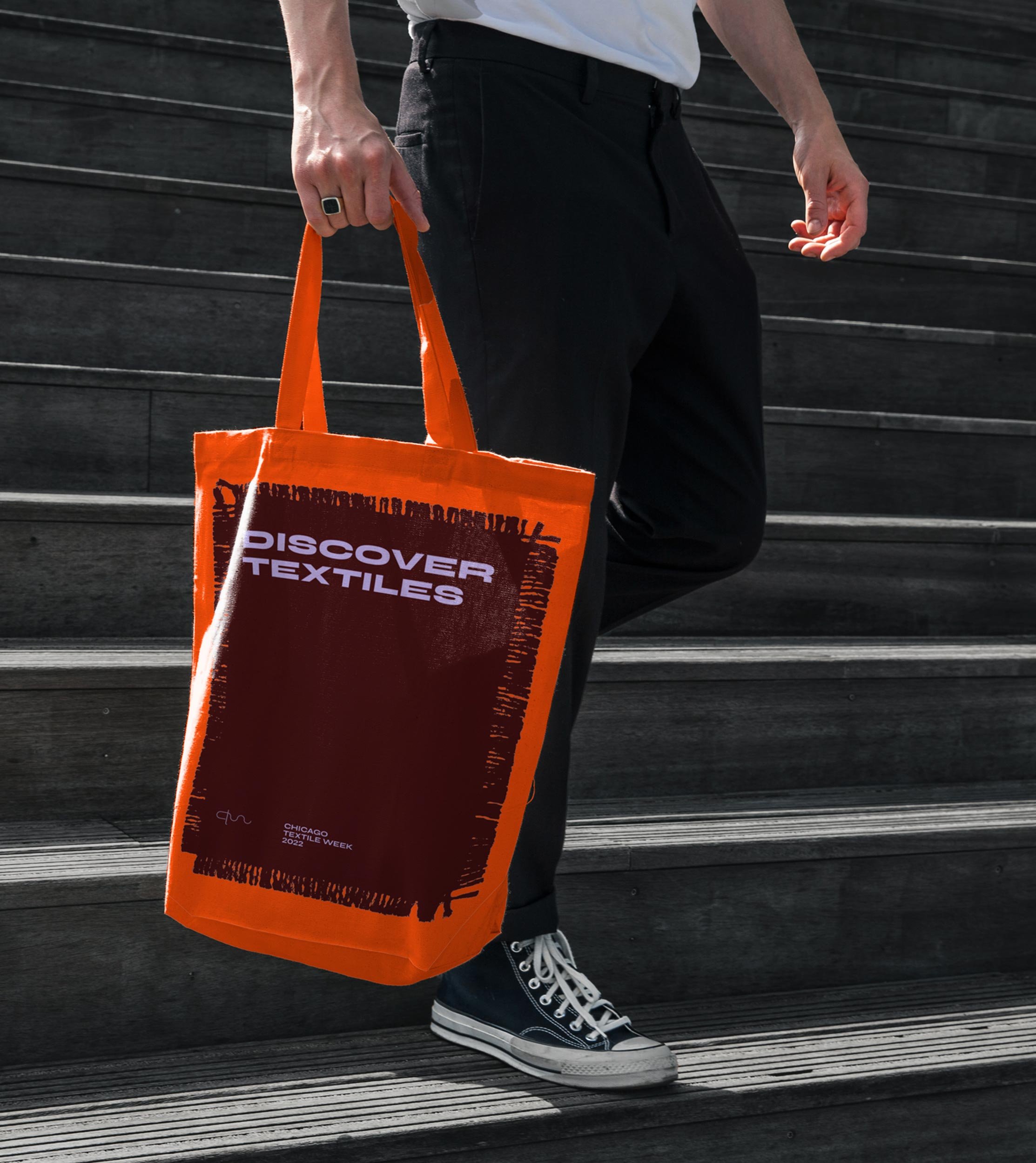
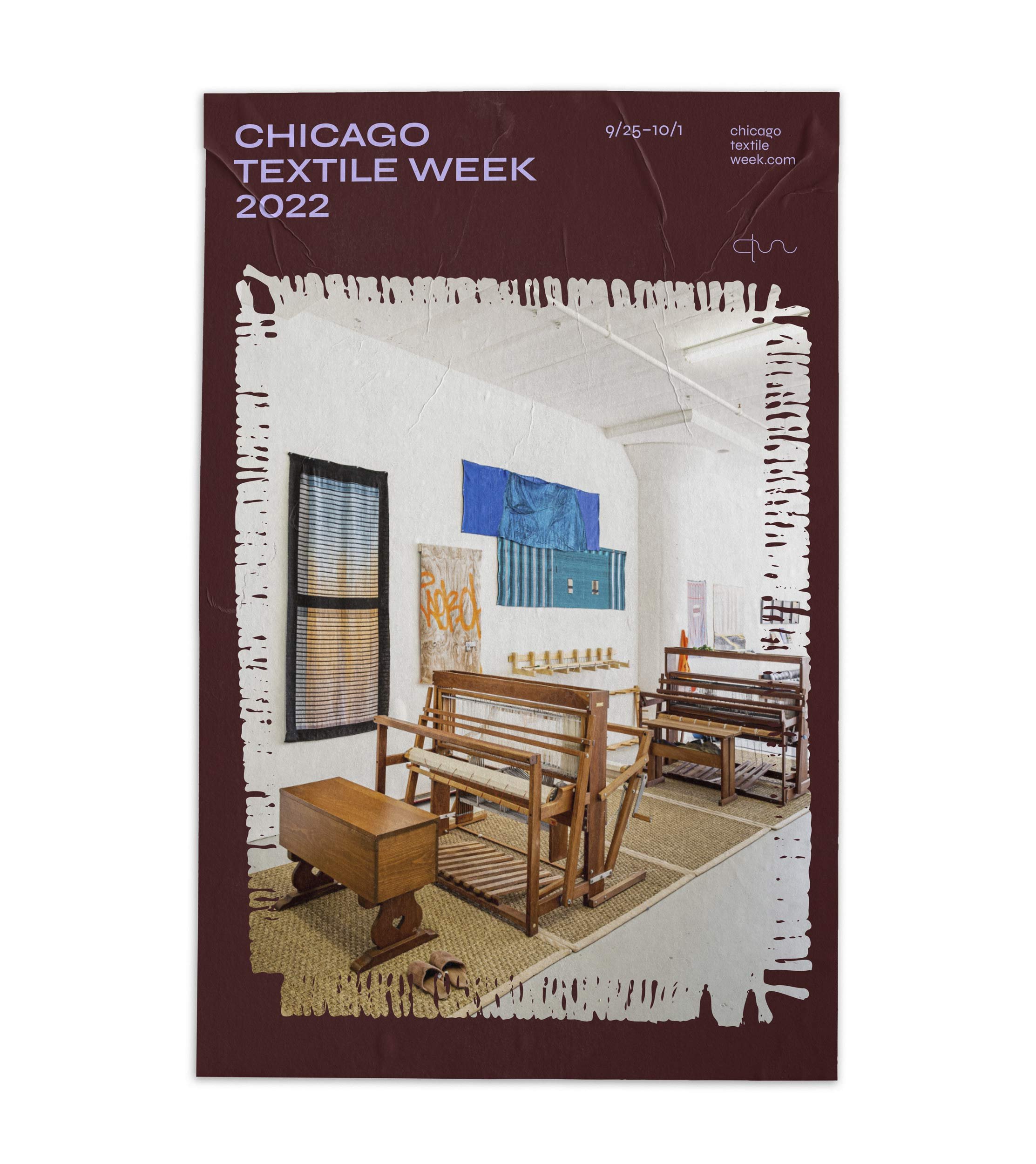
Graphic illustrations of real textiles form the basis of the visual language, their frayed edges flattened and filled with vibrant color and imagery.

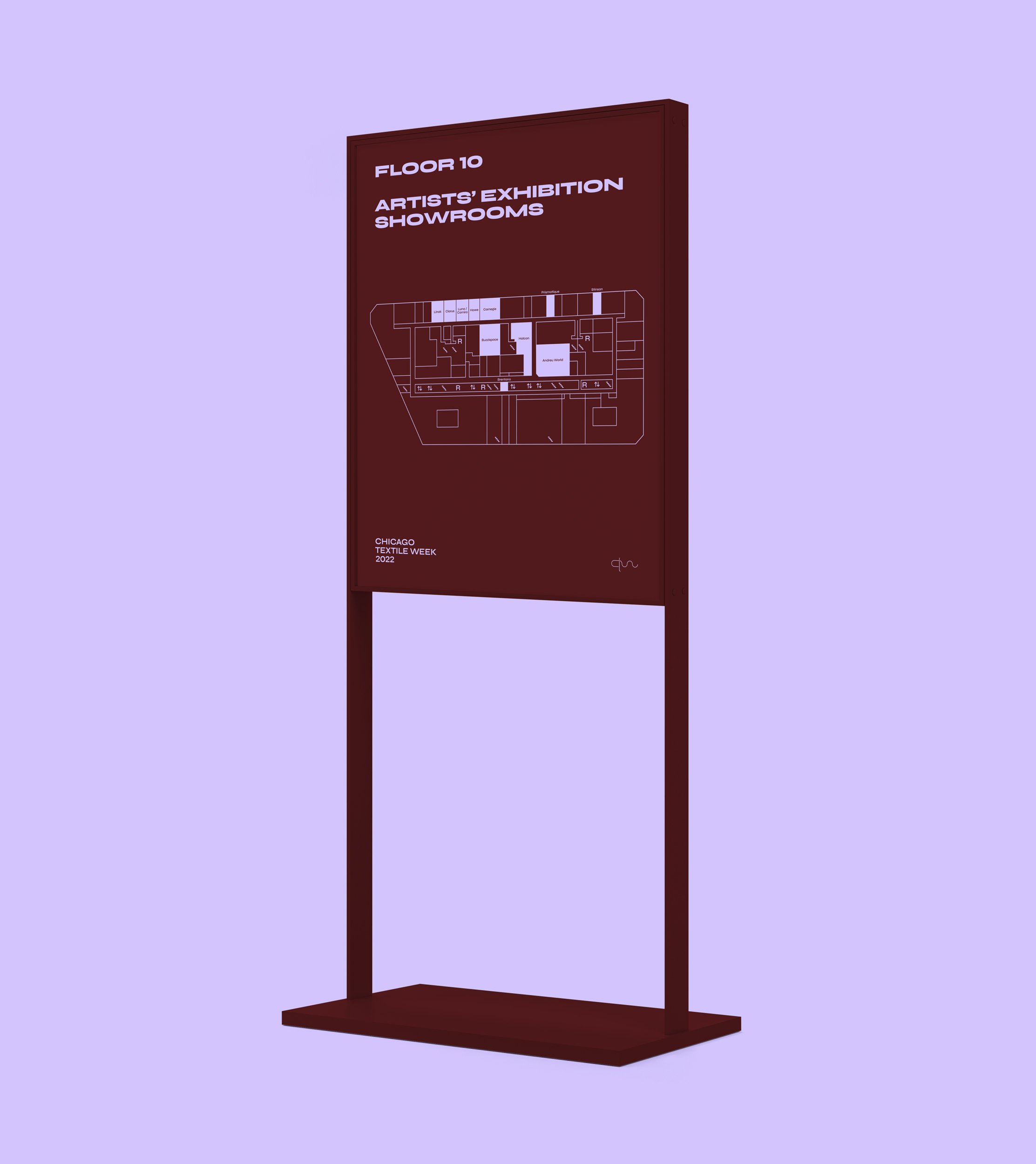
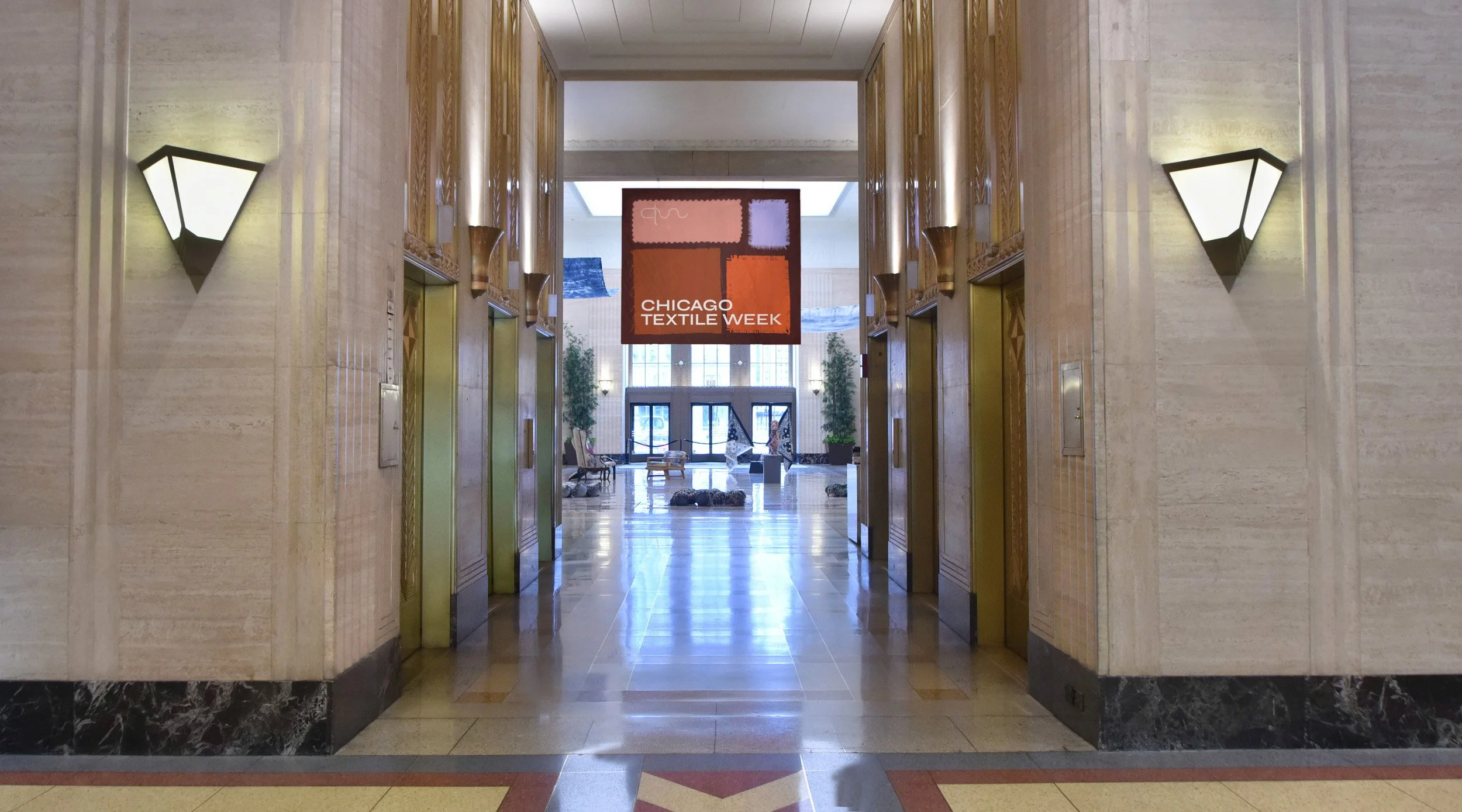
Banners, freestanding signs, and digital ads were dispersed throughout Chicago’s iconic Merchandise Mart.

Chicago Textile Week
When our friends at Carnegie Fabrics approached us about the events happening at Chicago Textile week, we were intrigued by its ability to integrate multiple industries in its programming. Based off of “Good Design” hosted at theMart in 1947: an event that combined professionals from the Interior design, furniture, and industrial design industries, Chicago Textile Week weaves together the interior design, fiber art, and fashion industries into an exploration of Chicago's past and future of textiles. The event was first held in 2019 and its rapid growth in popularity meant a quick turnaround when we were asked to design their marketing campaign and signage strategy. Working closely with the client and Chicago Textile Week sponsors, our multidisciplinary design team established a graphic language that spoke to the nature of textiles, while conveying information in a bold, yet minimal way.
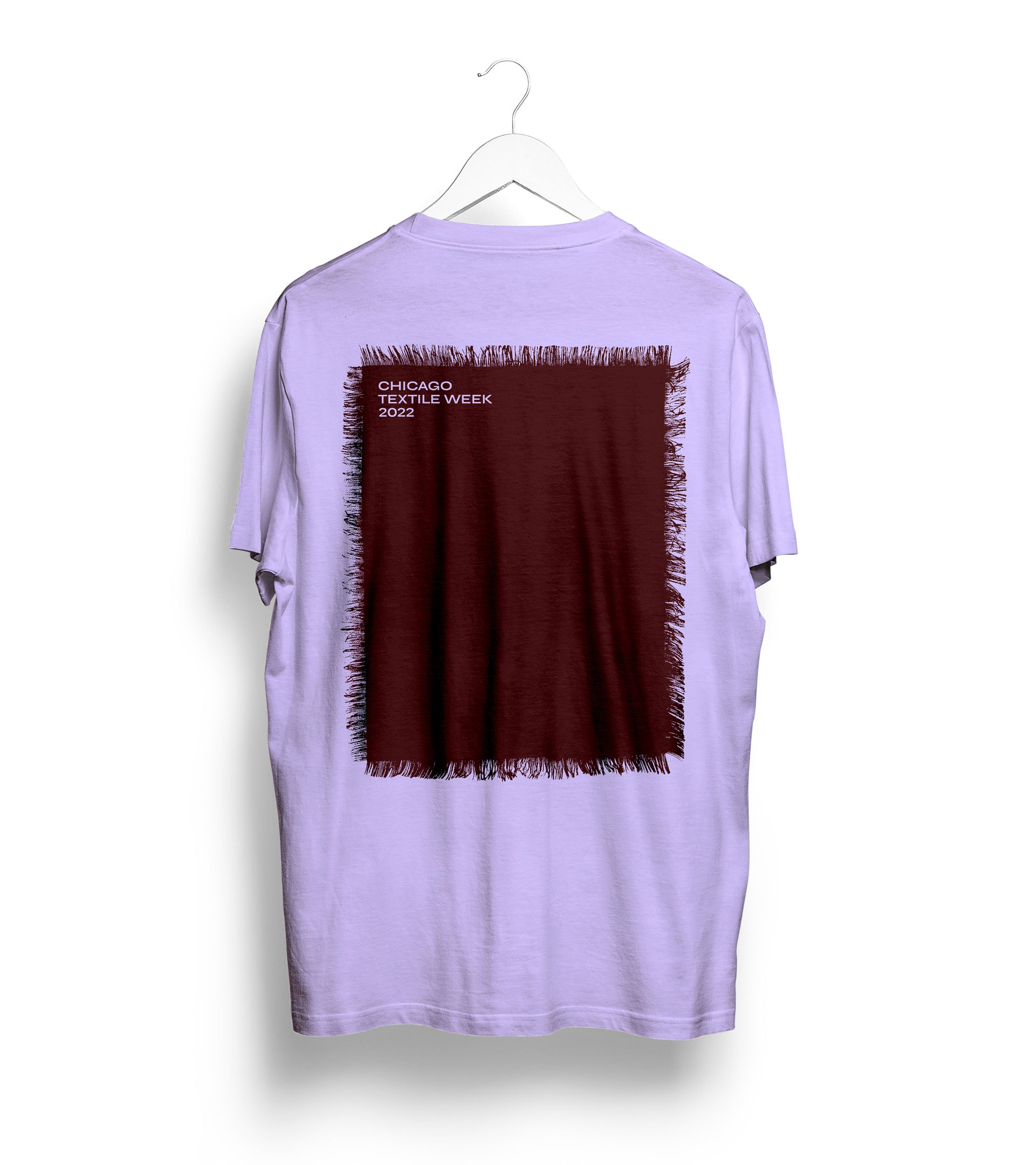
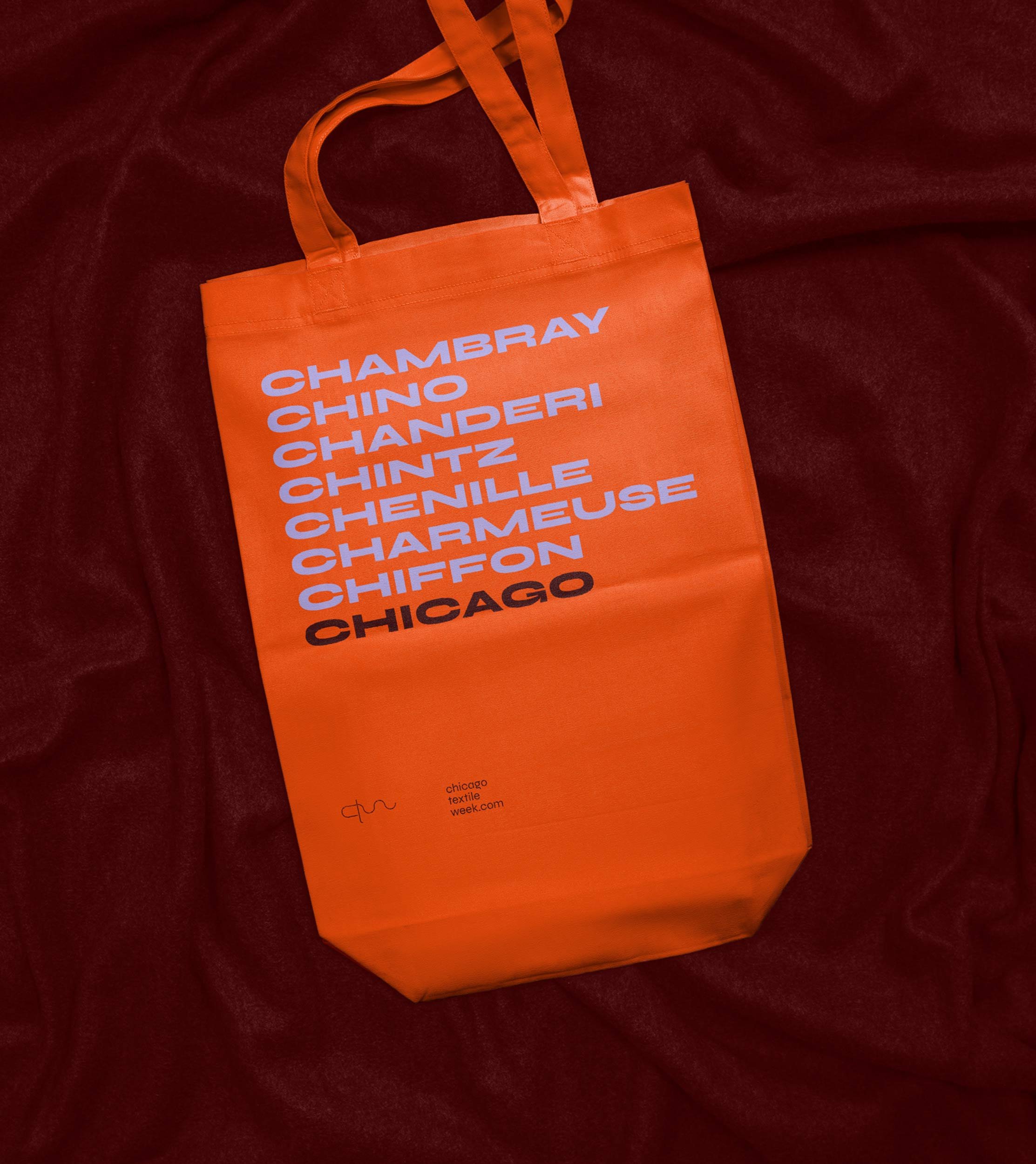
On print and digital material, including advertisements, we implemented a new color scheme and typeface, developed in collaboration with Chicago Textile Week exhibiting artist, Hope Wang. in addition to a graphic framing system. The typeface, Syne, was chosen for its similar qualities to textiles. As lineweight increases and letters become more bold, the pliable typography expands and makes a wide statement, similarly to a stretched piece of fabric. , we paired this energetic, yet structured font with a balance of soft and bold colors, representing textiles in their most basic tactile form. Graphic illustrations of real textiles then used these colors to cut out frames for promotional photos, maintaining a minimal palette and interweaving an organic appearance that balances the rigidity of the typography. Across all touchpoints, Chicago Textile Week’s graphic identity intertwines the organic properties of textiles with the bold and energetic nature of the event and the industries it engages with.
Location
Chicago, Illinois
Services
Brand Identity
Digital
Print
Signage
Wayfinding
Placemaking
Photography
Leslie Sadkowski
Partners
THE MART
Full Line Printing