

M-O worked with the Village of Mount Prospect to develop a comprehensive, functional and distinct wayfinding signage strategy that assists with navigation throughout the downtown area while creating a fresh identity for the area.

Even though village officials had been actively developing the downtown for decades, commuters returning from work tended to disembark, head straight for their cars, and drive home. Residents perceived the area as a place to pass through, not as a destination. It was clear that something was needed to increase awareness and visibility of the various destinations that existed downtown.
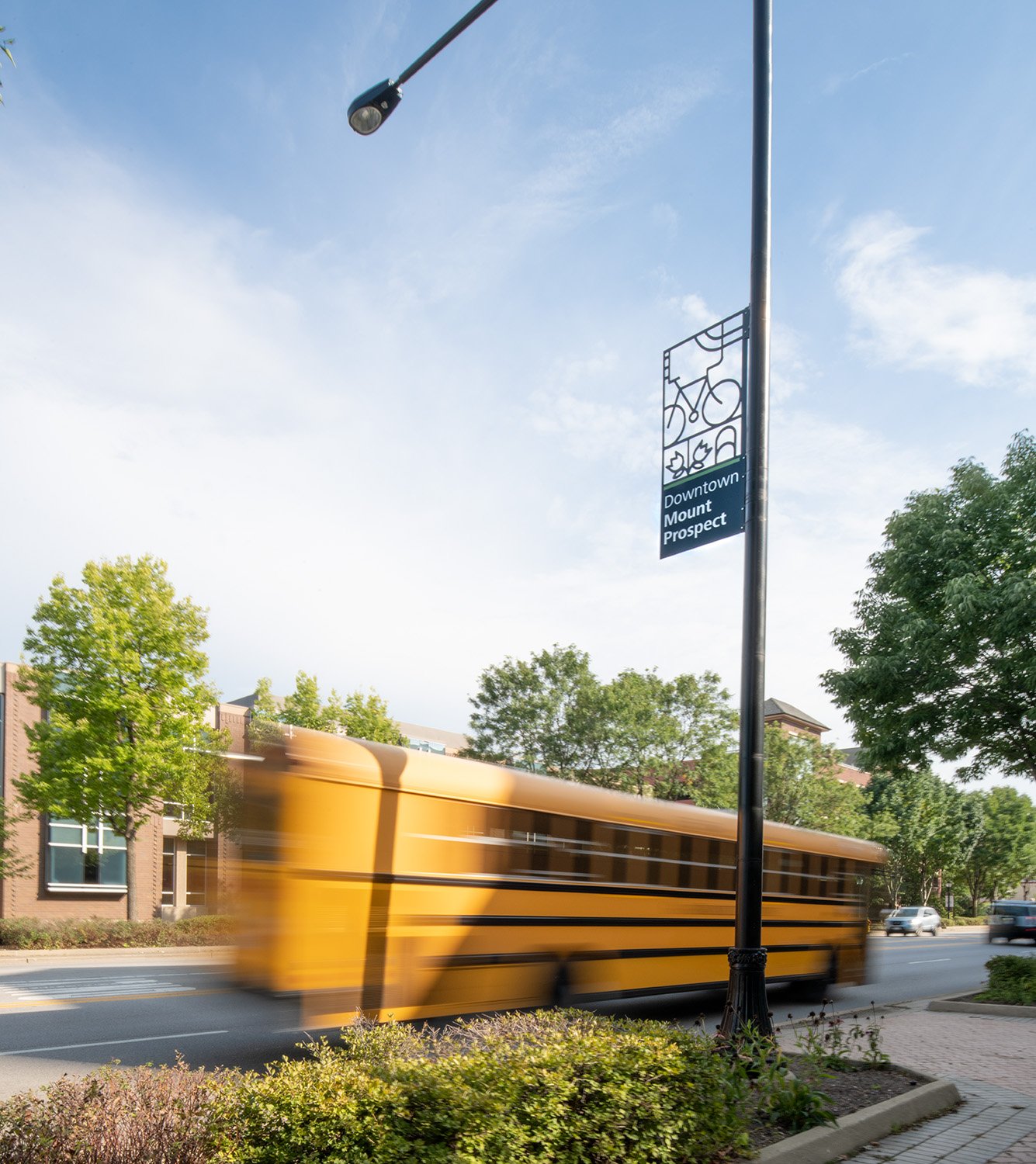
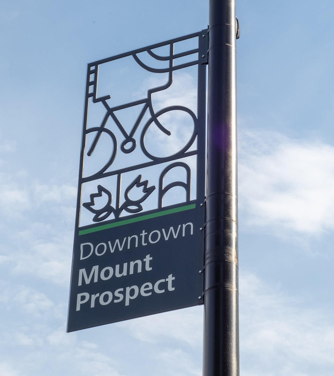
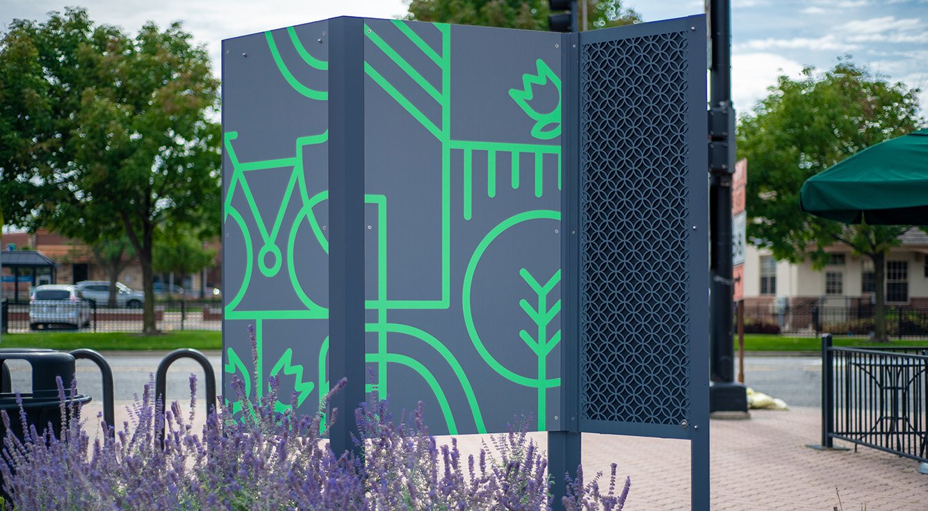
Village leaders had recently embraced a new branding campaign that incorporated bright colors—orange, yellow, green, and purple. The new signs incorporate the same colors, adding a lively counterpart to the downtown’s many brick buildings and drawing on color’s ability to aid memory.


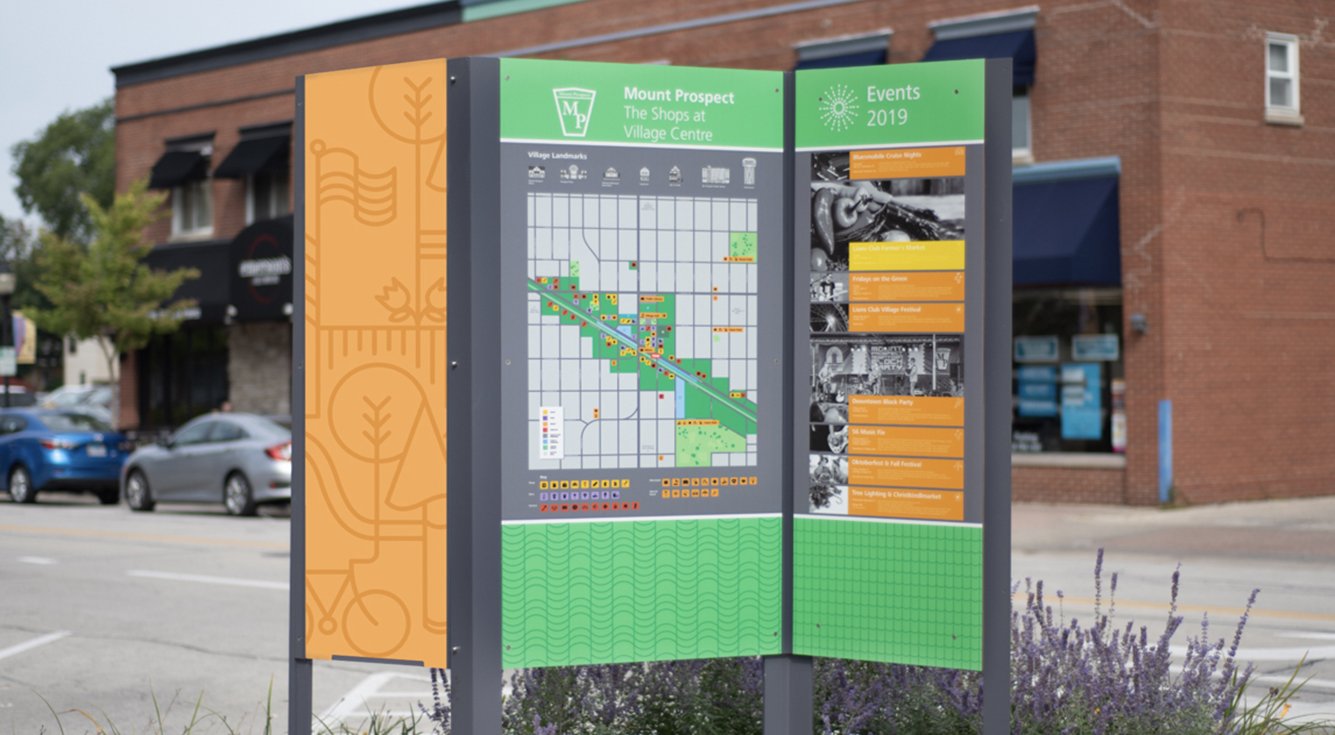
Custom maps outline points of interest, with modern graphic icons identifying types of business—burger joints, coffee shops, skateboard shops. Other pictographs identify landmarks, such as the water tower, the Metra station, and the library.


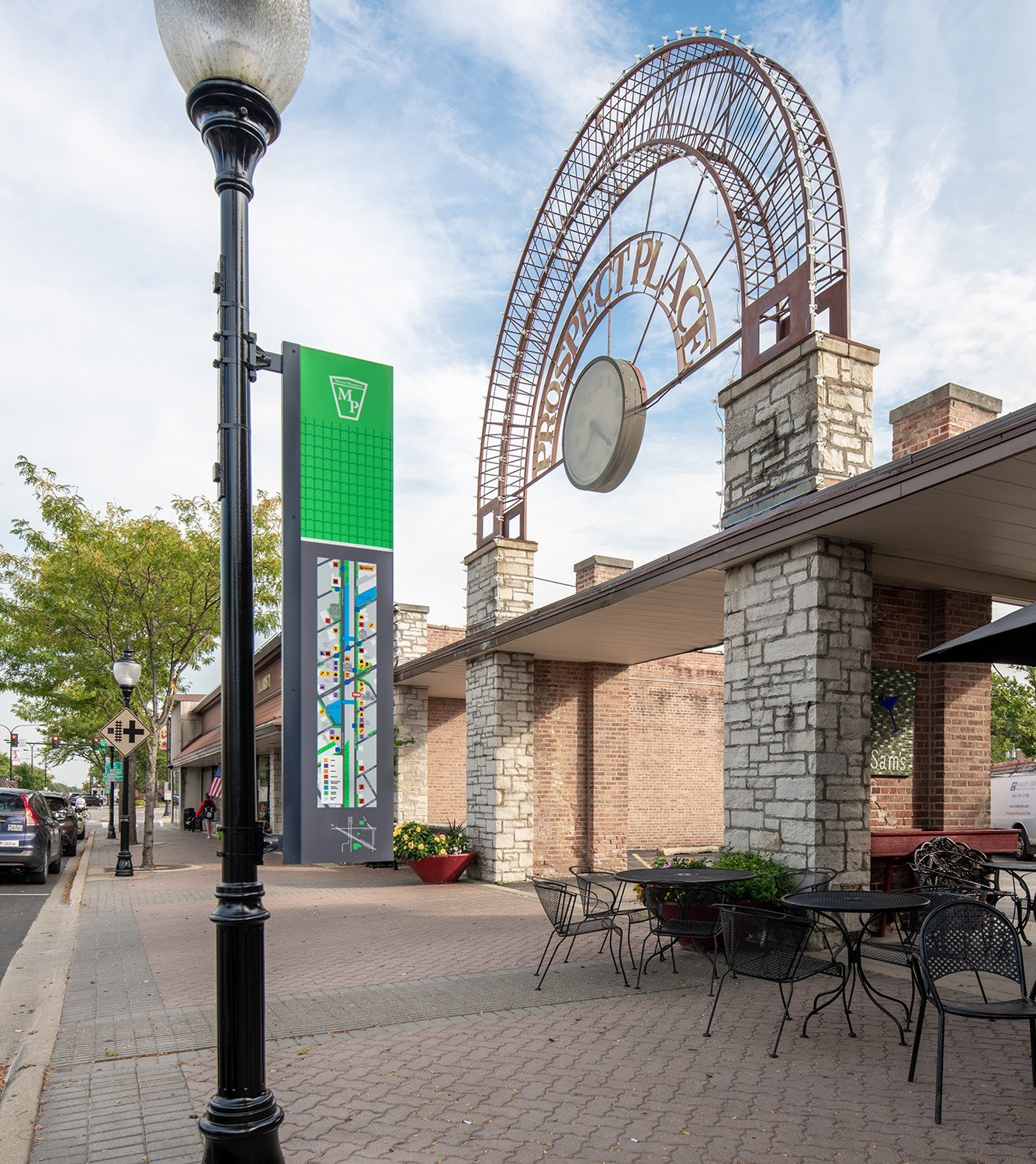
Signage is placed along key view corridors and decision points through the Village. The strategy is based on a bread-crumb system that’s both map and icon based. It incorporates a unique graphic identity for the village, and uses a kit of parts that can be expanded and adapted according to current and future needs.


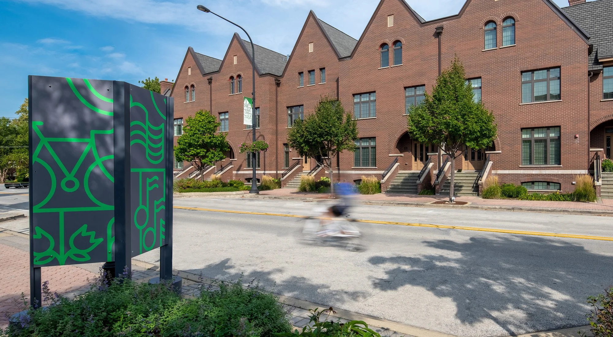
Signage is designed to be viewed from all sides. A vibrant graphic pattern and lattice detail catches viewers eyes from the back, from the front it includes various graphic information panels.

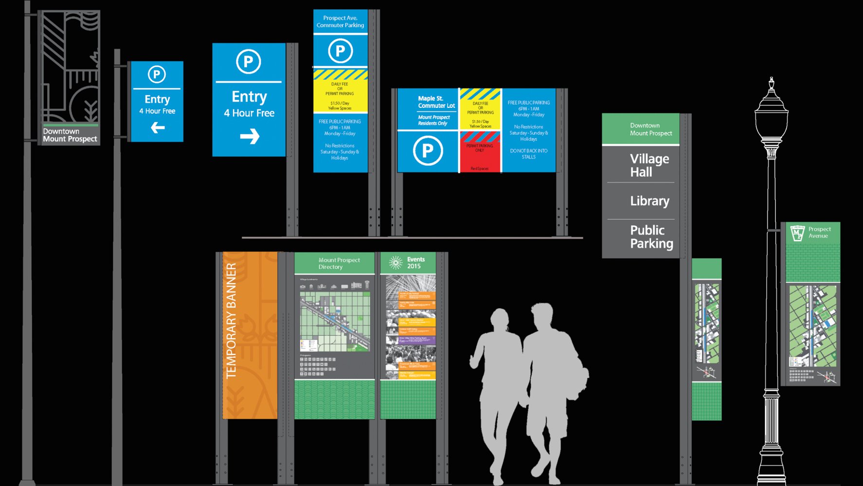
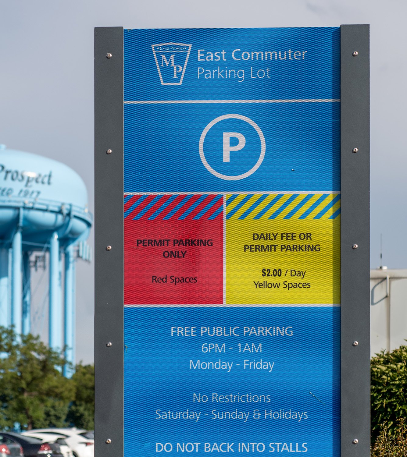
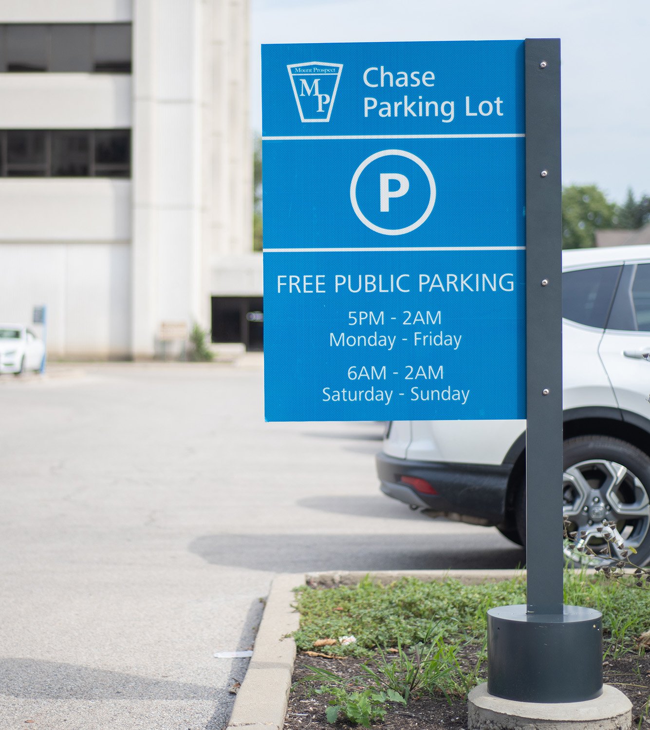
To round out the signage family, new parking signage helps to safely direct those commuting in the downtown area and gives clear distinction of parking availability offered to the public.


Village of Mount Prospect
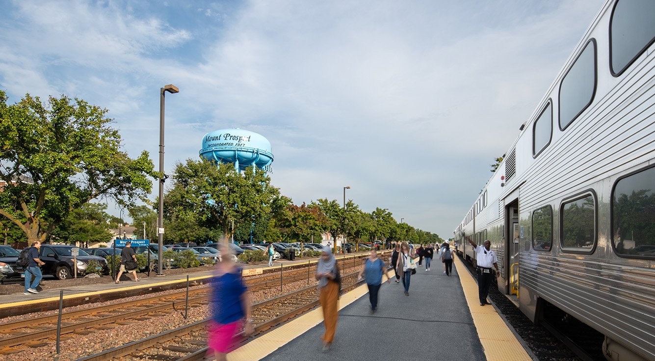
The Metra Commuter Rail, one of the busiest commuter-rail lines in the United States, cuts through the middle of Mount Prospect, Illinois. With a population of 54,000, the village is a desirable place for commuters to live. It offers tree-lined streets and a well-regarded public school system, all only a 45-minute Metra ride to Chicago’s urban core from the downtown station.
Even though village officials had been actively developing the downtown for decades, commuters returning from work tended to disembark, head straight for their cars, and drive home. Residents perceived the area as a place to pass through, not as a destination.
The village worked with designers on the ideation and implementation of wayfinding signage for its downtown. The program needed to create a sense of place and provide residents and visitors clear directions to parking, points of interest, general business areas, special events, and services.
Mount Prospect’s existing signs were small and oddly placed, and they blended into the surroundings. There were cases of redundancy and contradiction due to the gradual posting of signs over many years. Parking, in particular, needed to be addressed. Even though downtown had plenty of parking spots, many residents believed it was hard to find parking there. In some instances, two signs said the same thing but in different ways. In other cases, adjacent signs gave two different time limits or made it seem as if only public employees could use a parking structure that actually was open to everyone.
Interviews with residents revealed that those who did visit downtown navigated based on landmarks, such as the bright blue water tower visible from the train or the Veterans Memorial Band Shell. At the same time, downtown was changing, with buildings being torn down and new construction going up, much of it in red or brown brick. The area needed a stronger sense of place.
In response, the new wayfinding program placed signage along major connection streets to better define the downtown area while creating a visual identity based on abstracted illustrations of what being in the city is like. Custom maps outline points of interest, with modern graphic icons identifying types of business—burger joints, coffee shops, skateboard shops. Other pictographs identify landmarks, such as the water tower, the Metra station, and the library.
The system consists of a kit of parts, including easily updatable sign panels to highlight events such as Friday night concerts at Village Hall’s Centennial Green.
Village leaders had recently embraced a new branding campaign that incorporated bright colors—orange, yellow, green, and purple. The new signs incorporate the same colors, adding a lively counterpart to the downtown’s many brick buildings and drawing on color’s ability to aid memory. To inform commuters as they walk from car to train, new kiosks at strategic locations increase visibility of downtown destinations.
As the Village of Mount Prospect continues to integrate young commuters to their community of long-established residents, their new wayfinding system aims to be a welcoming and unifying feature for the area.
Location
Mount Prospect, Illinois
Services
Placemaking
Wayfinding
Press
Urban Land Institute
Daily Herald
Photography
Francisco Lopez de Arenosa
Partners
Village of Mount Prospect
Poblocki Signs
Appleton Signs
Burns and McDonell