

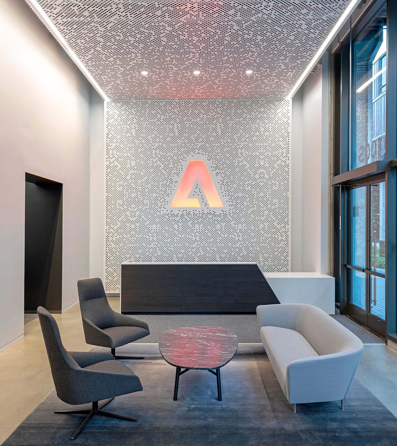
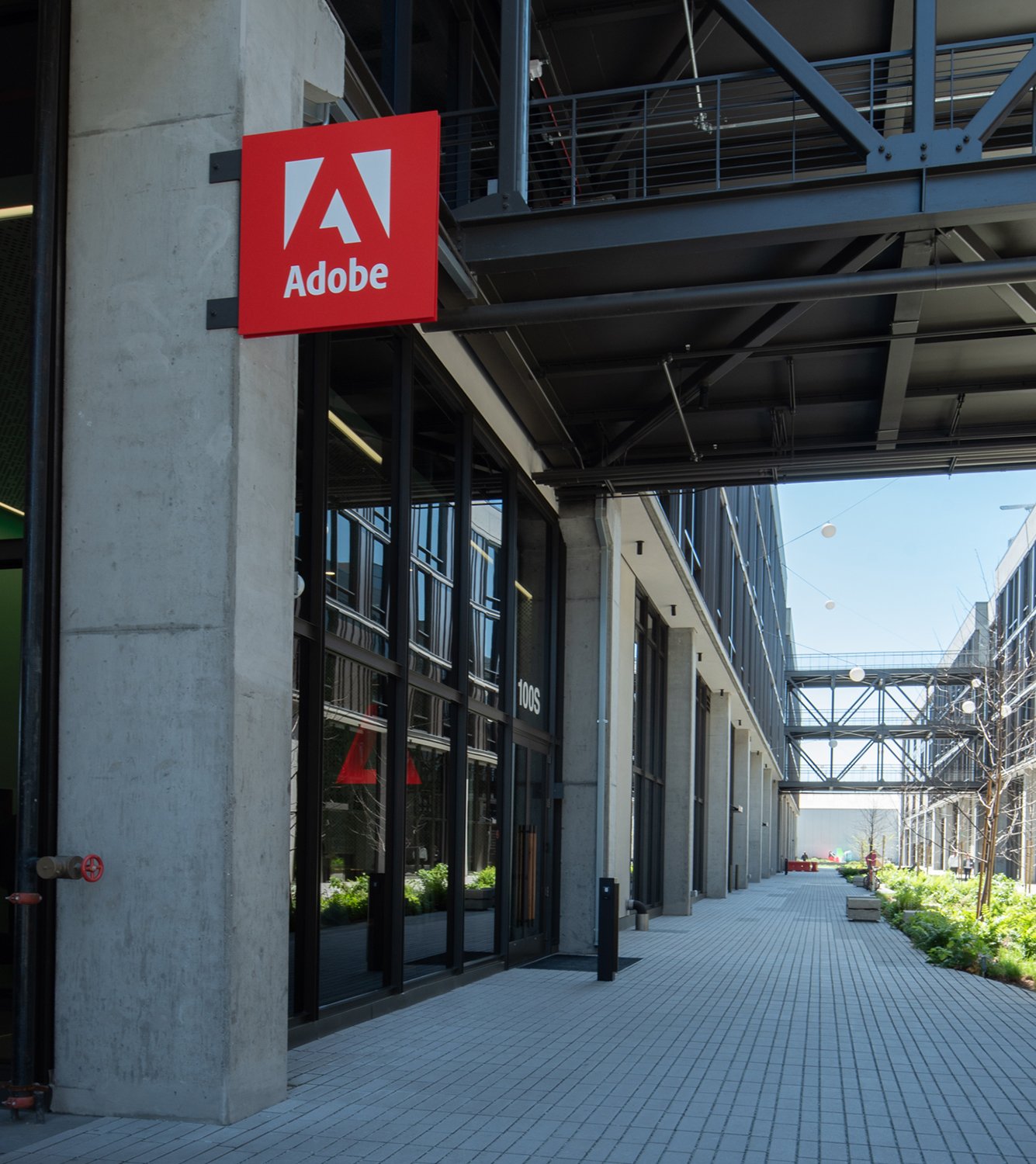
Embracing color and its significance to Adobe, the 250,000 SF office building in San Francisco embraces the company’s ethos—everything is designed to be ‘globally consistent and locally relevant.’
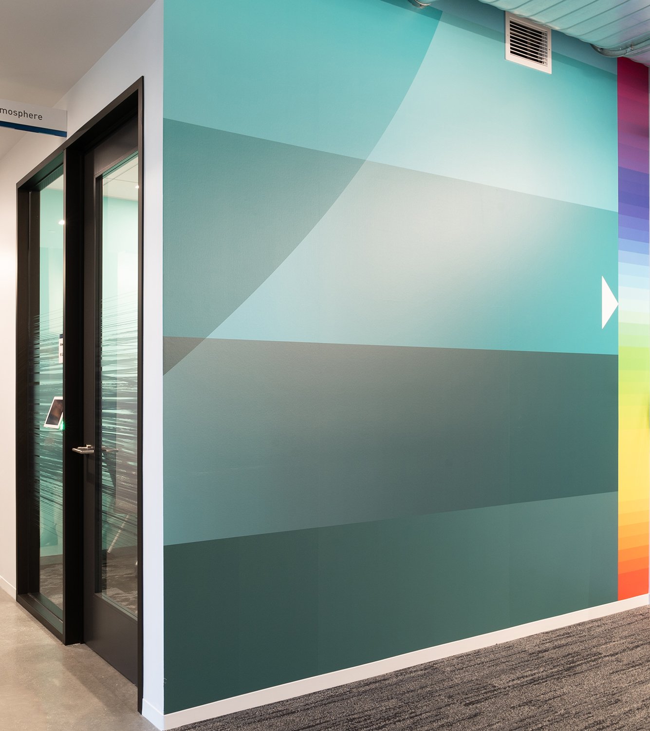

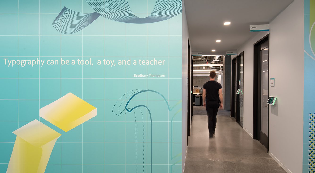
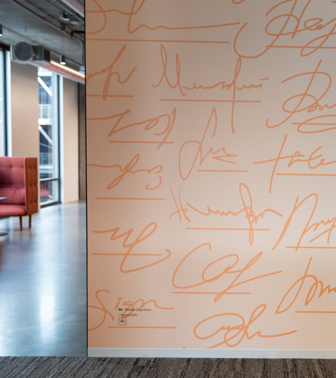
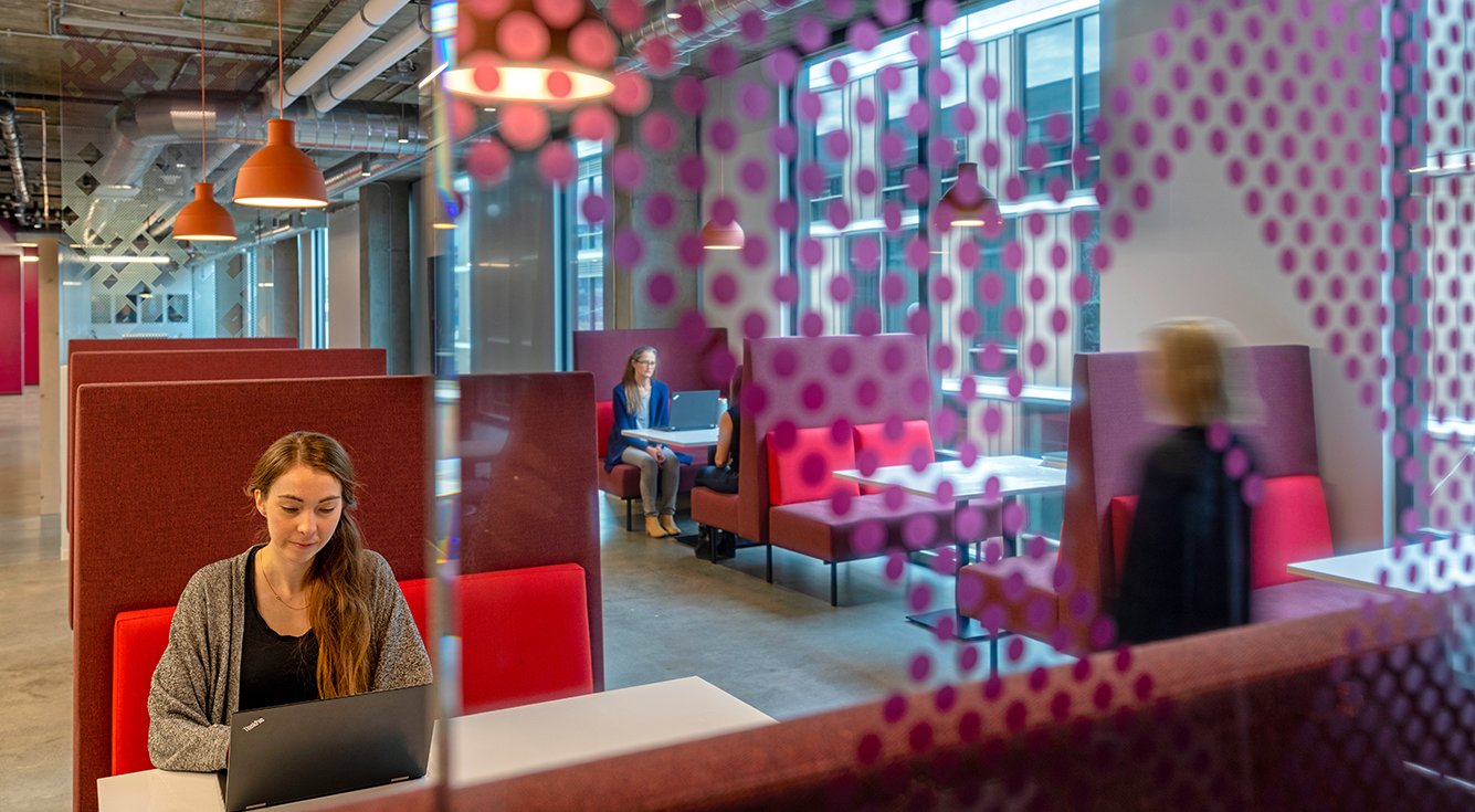
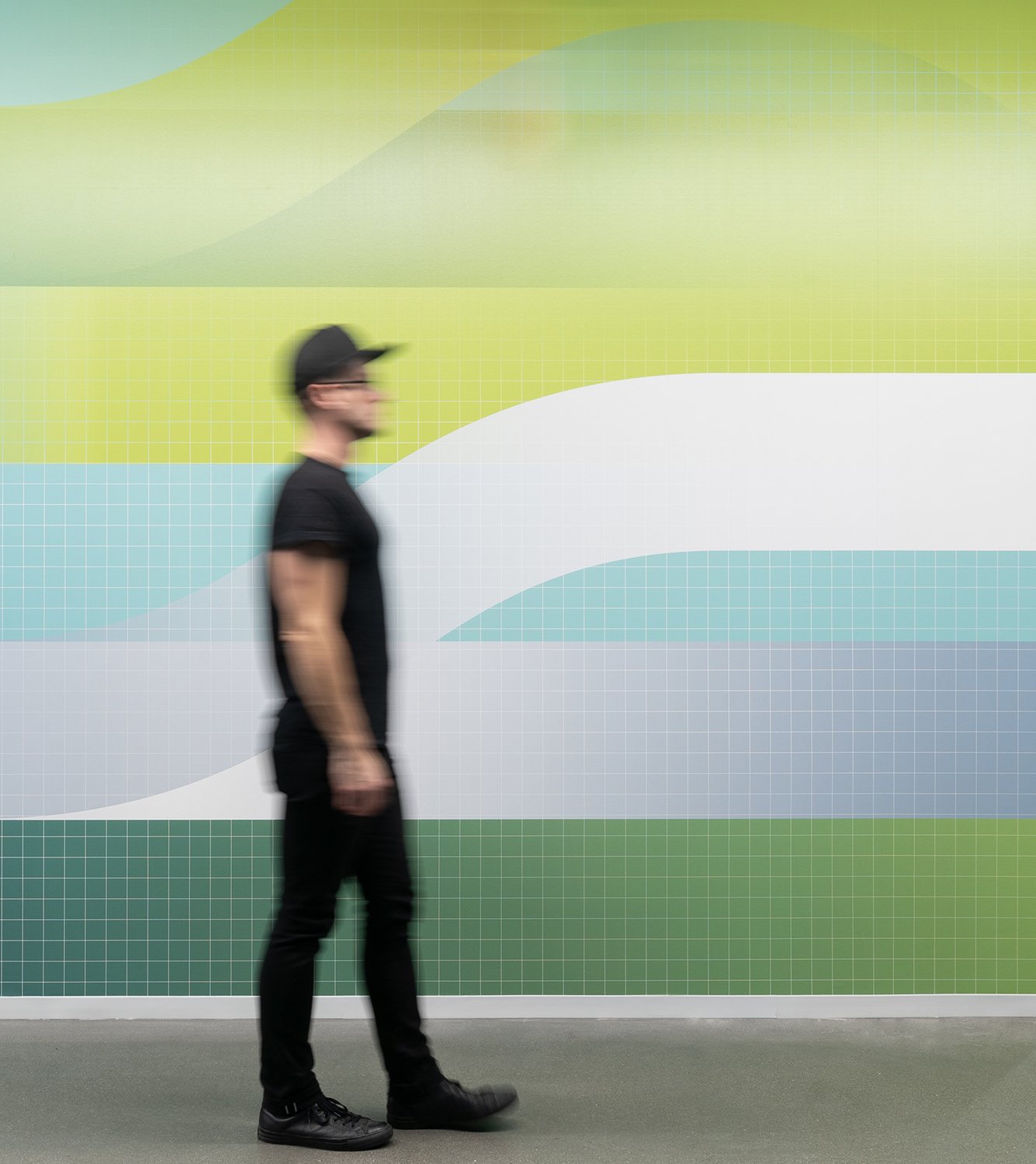
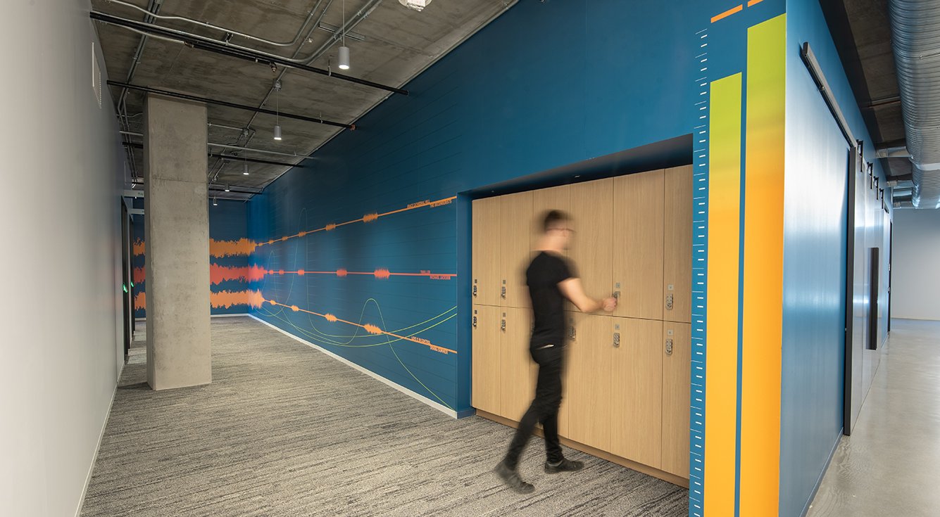
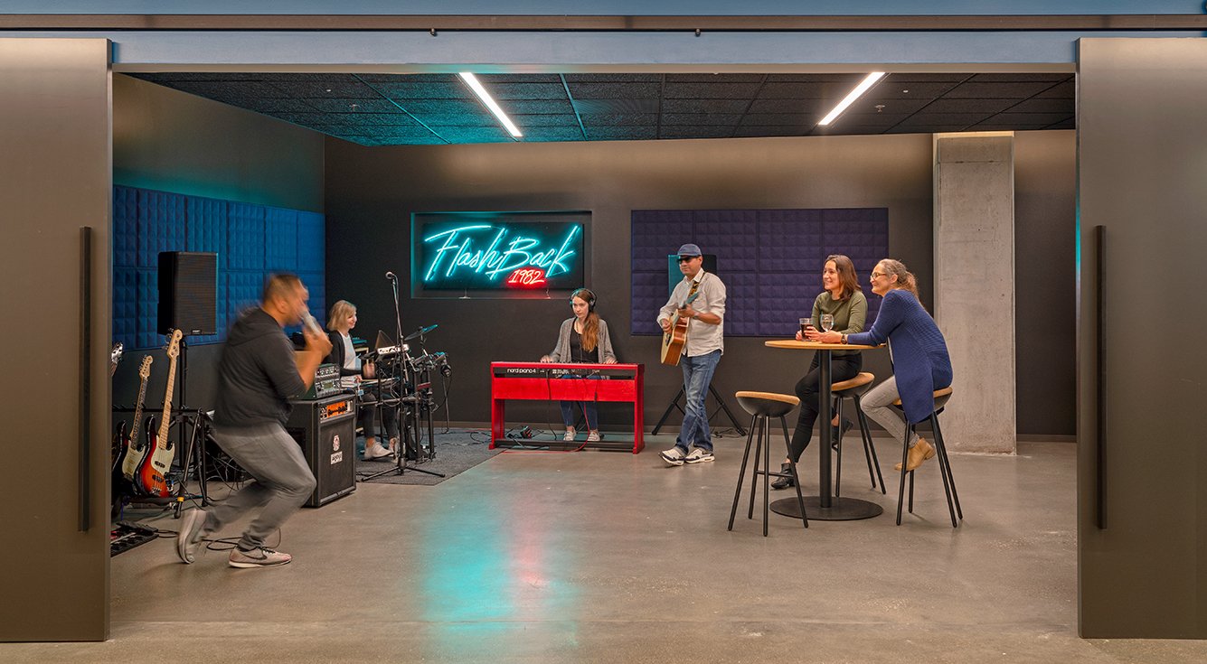
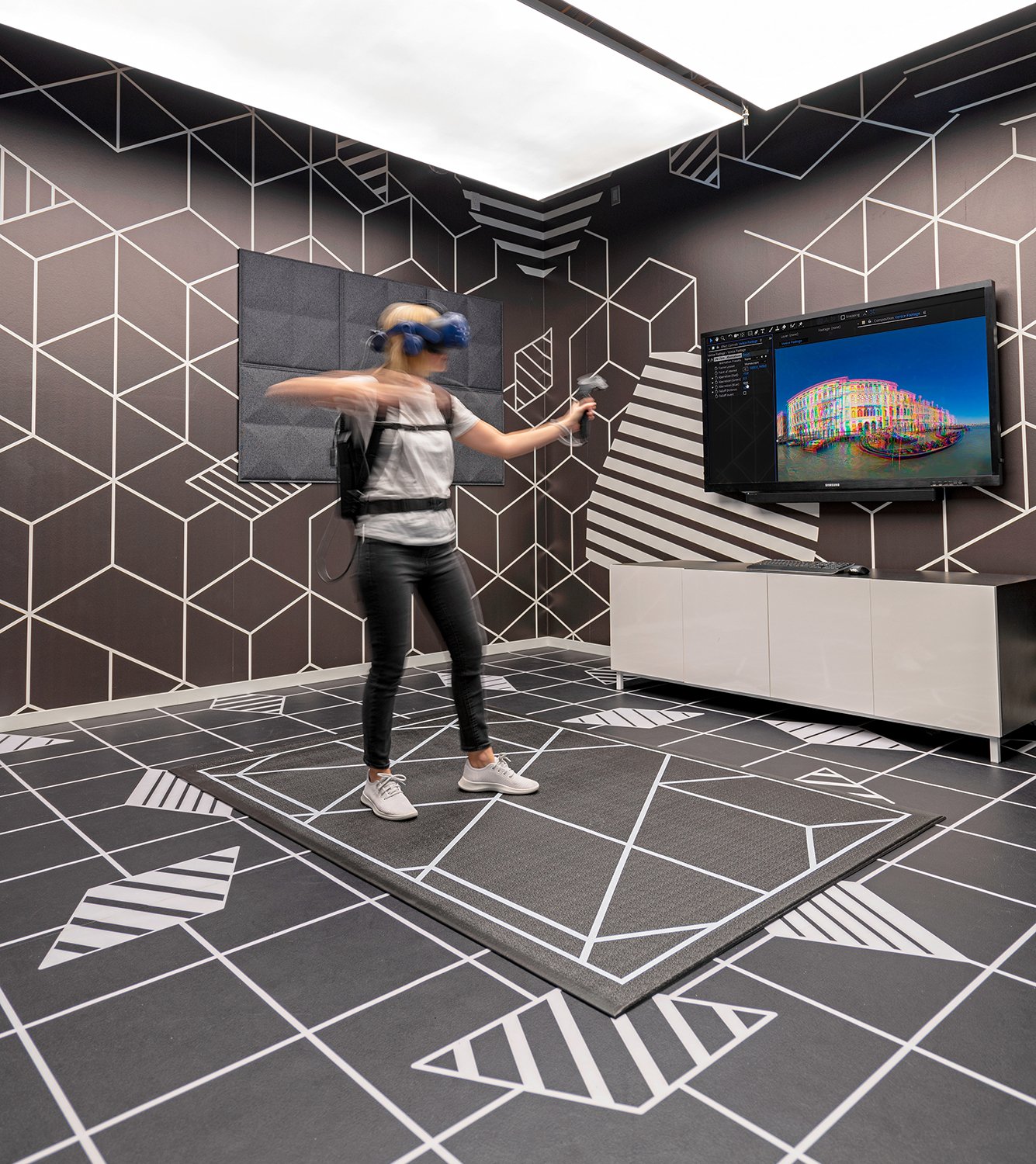
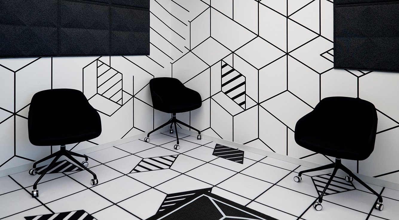
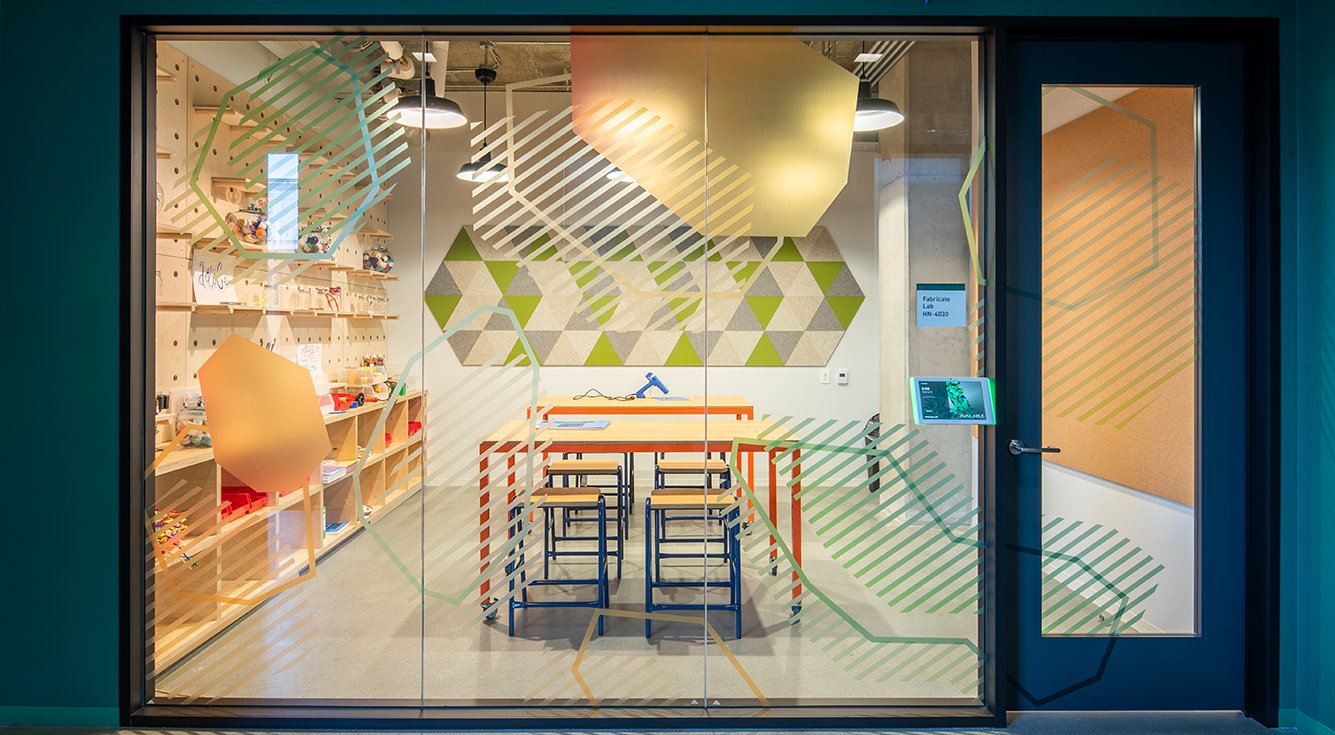
Wall graphics throughout the office reflect Adobe's brand, culture, and products. Some are inspired by the software itself, using enlarged color pickers from Photoshop and typographic elements from Illustrator.
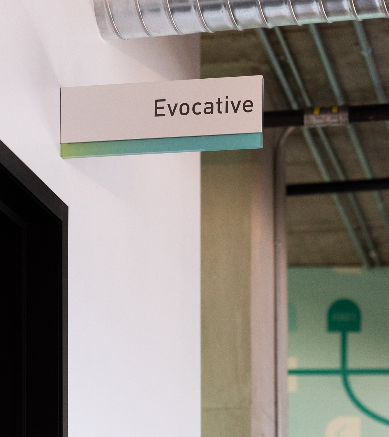

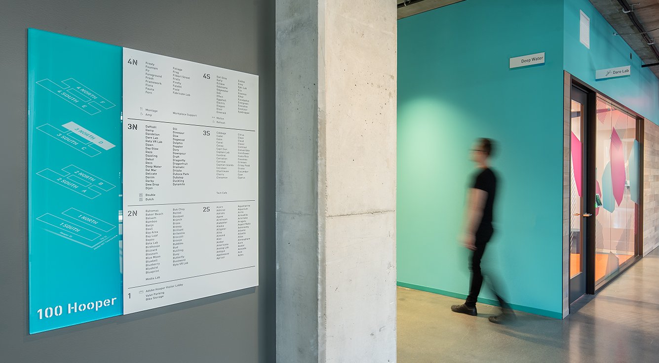

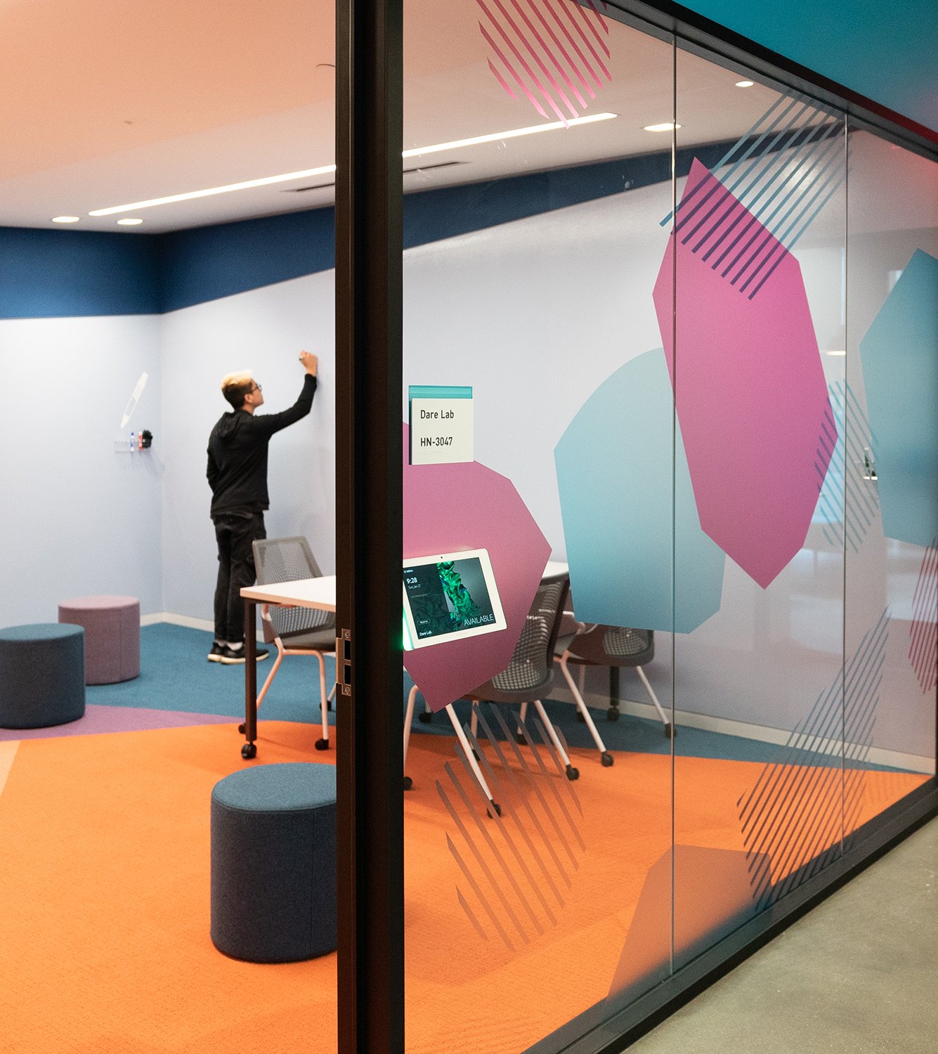
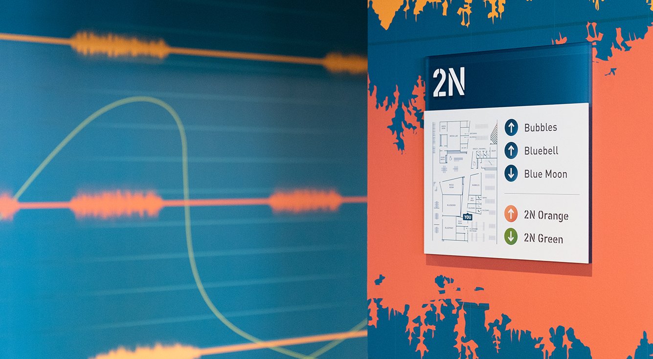
Horizontally, the space is divided into six zones, each with its own signature color integrated into every piece of the interior--from signage and graphics to paint, furnishings, and finishes. The building directory includes a simplified map of the entire building which gives an overview along with a full list of meeting rooms.
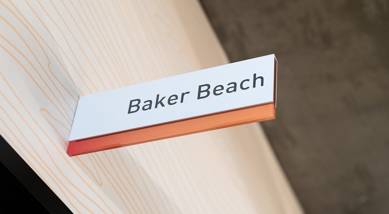
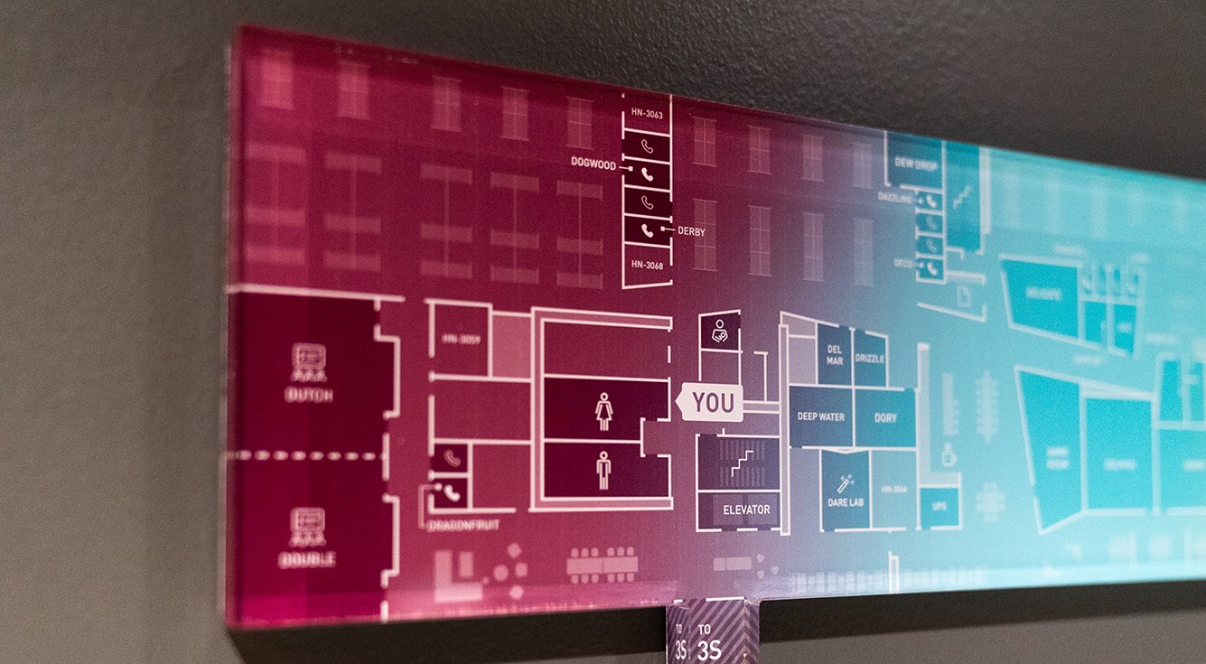
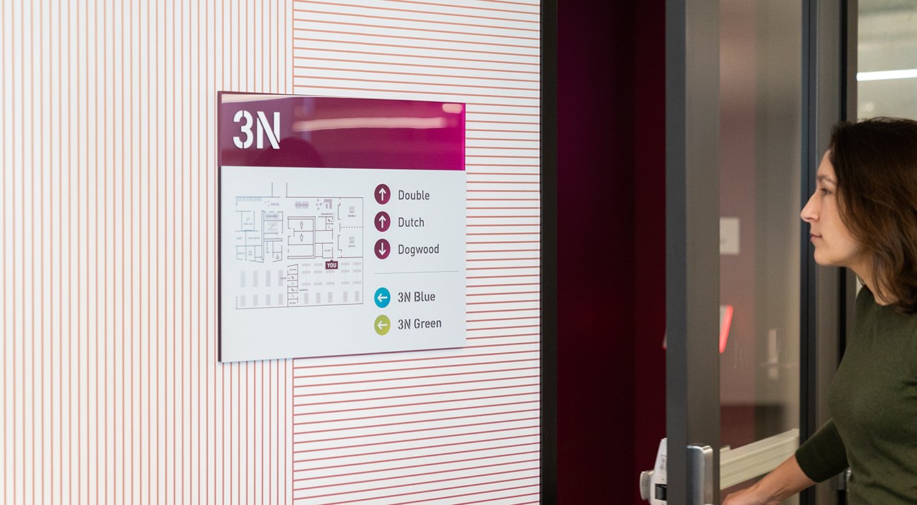
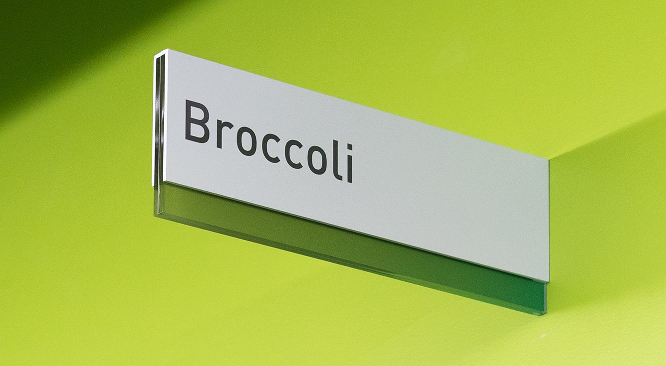
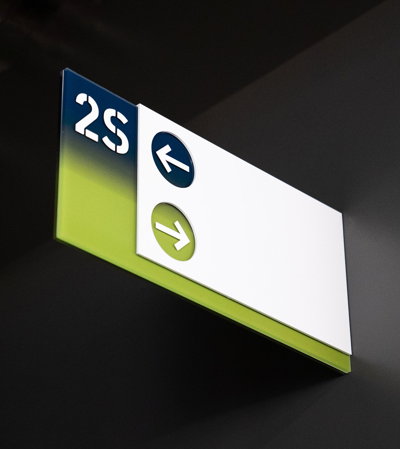
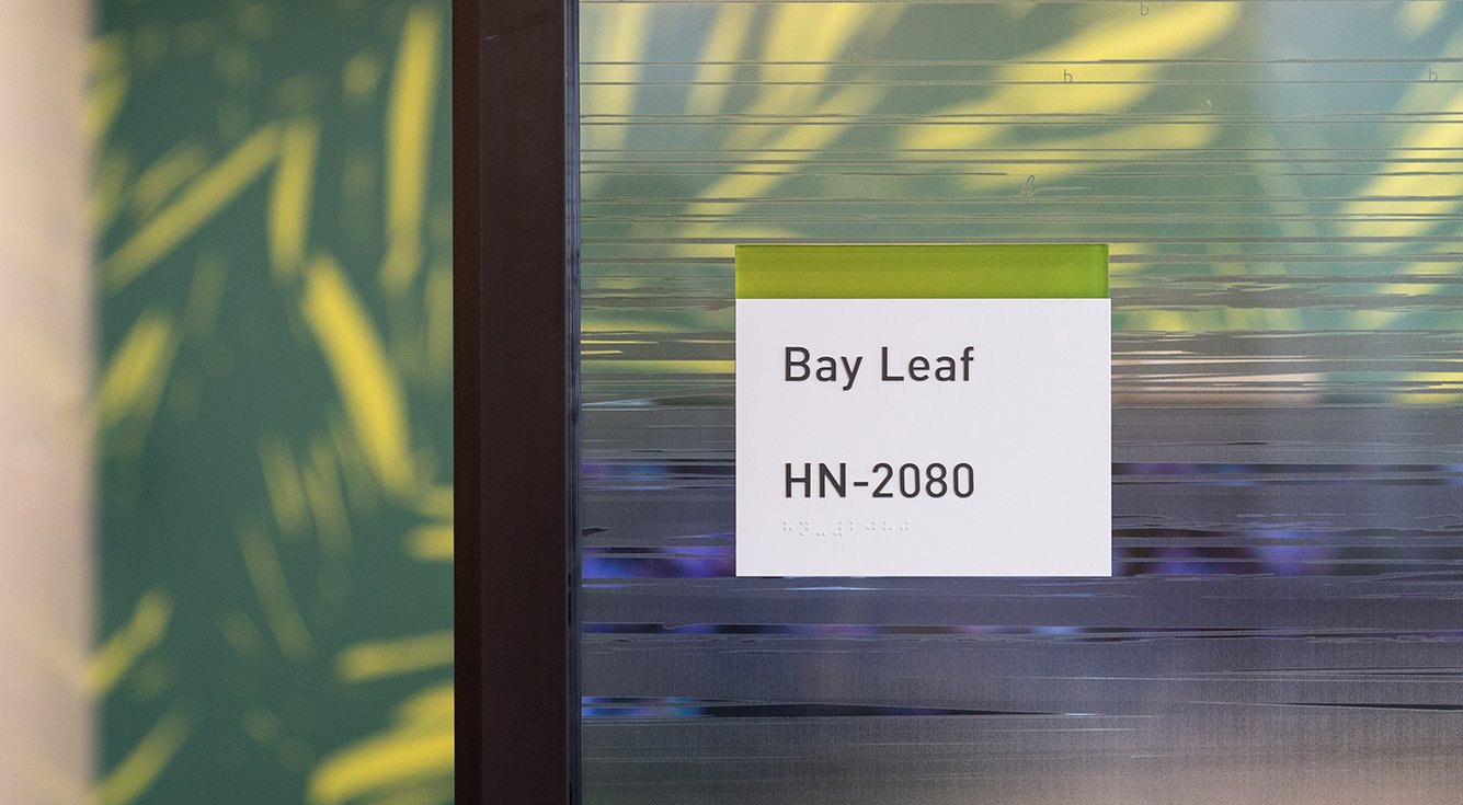
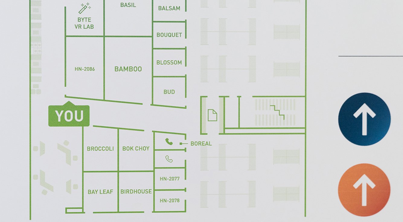
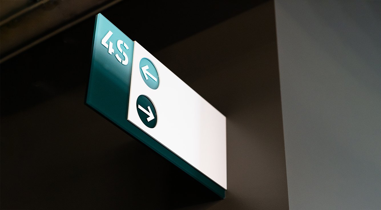
Staff + visitors are able to easily navigate to meetings rooms and neighborhoods based on the color and alpha zone system. Projecting directional signs and mini-maps are located at key intersections to help direct along your way.


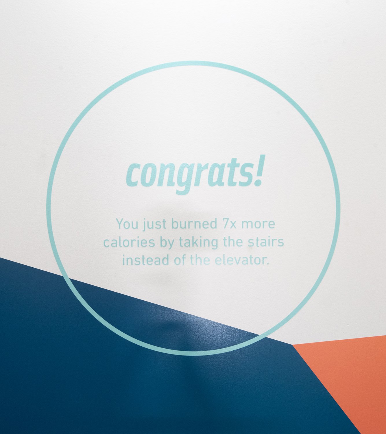
As part of the FitWel program, wellness tips and facts are integrated to motivate employees and encourage a healthier workplace.
Adobe 100 Hooper - Workplace
For an enterprise consistently pioneering in the design and production of digital tools, it was clear that their workplace needed to reflect the creativity behind the brand and to celebrate their innovative products. Embracing color and its significance to Adobe, the 250,000 SF office building in San Francisco embraces the company’s ethos—everything is designed to be ‘globally consistent and locally relevant’.
The wayfinding system at 100 Hooper, is therefore based on a story of color that creatively organizes horizontal and vertical circulation while integrating ‘destinations’ or ‘zones’ with art. Horizontally, the floorplates are divided into six zones, each with its own signature color. These colors have been integrated into everything within the built environment — from custom designed signage and environmental graphics to the paint, furnishings, and various interior finishes. A person’s first encounter with the new system is with two map-based signs — a full building directory and detailed level directory. The building directory includes a simplified map of the entire building which gives an overview along with a full list of meeting rooms.
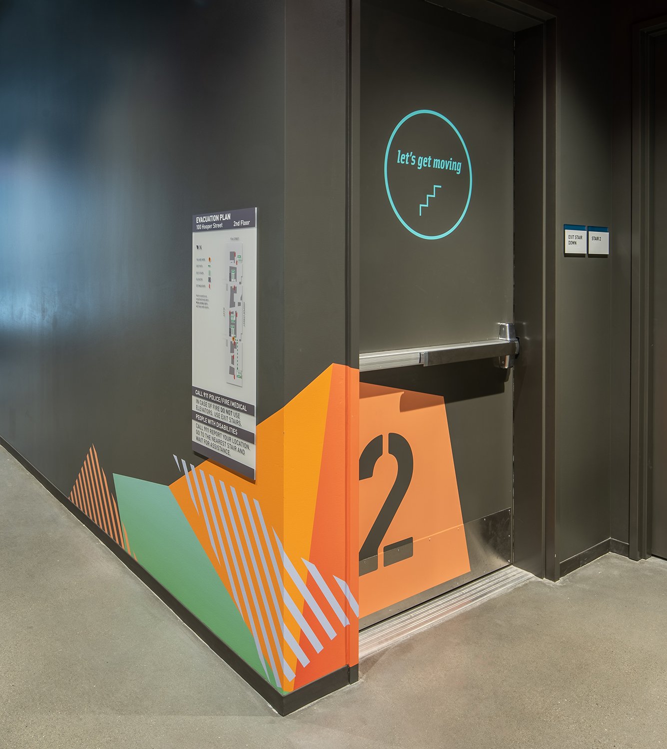
Vertically, the colors assist with orientation but are related to FitWel, a program committed to employee health and wellness. Playful colored shapes within the stairwells and on the doors highlight floors and help the concrete space feel inviting. At each landing, wellness tips and facts are integrated to motivate employees and encourage a healthier workplace.
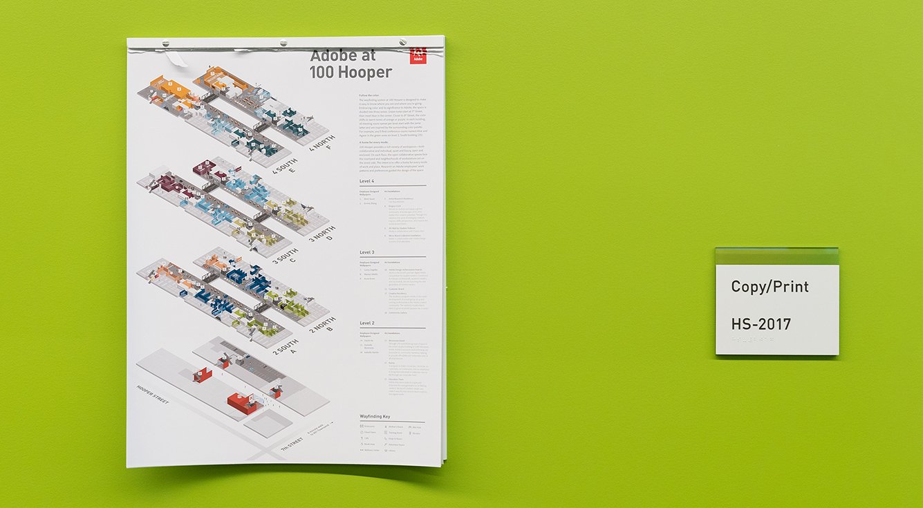
The overall scope for the project includes the design of a custom wayfinding system with 7-sign types and customized icon sets, an illustrated tearaway wayfinding poster, vibrant and dynamic graphic decals within the stairwells, 75+ custom designed wall graphics as well as 6-different privacy films. With this new system, users are able to easily navigate to meetings rooms and neighborhoods based on the color and alpha zone system.
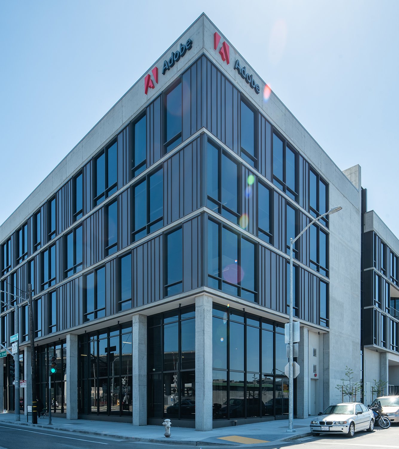
Location
San Francisco, California
Services
Placemaking
Wayfinding
Digital
Print
Signage
Environments
Art Direction
Awards
Notable-Visual Communication, Core77 Awards
Press
Office Inspiration
World Architecture News
Office Snapshots
GreenSource
Photography
Francisco Lopez de Arenosa
Joe Lawton
Allison Rokusek
Partners
Adobe Design
Ensemble
Architecture by
Gensler